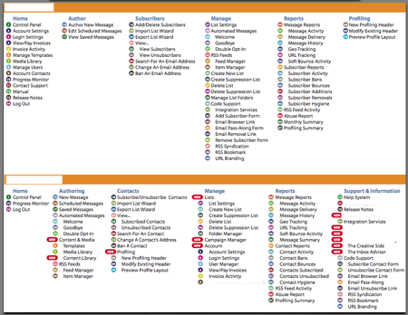
I just got an email from a web service about a huge redesign they did on their application. The email that came through mentioned some big updates to their navigation, which is always dangerous for usability. Check out how they decided to “make it easier” for their users. What a mess...
The image below is from their newsletter. The link goes to a 600kb PDF, which brings up a huge first page with their logo and brand and on the second page the next image is displayed. I was expecting more of a walk-through of the navigation…

The actual navigation description is a cryptic menu of numbered items. On the top, they show the previous navigation and on the bottom the new navigation items are displayed. By looking at this, I guess it must be printed and posted on the wall as you use the new design to find out where to go.

(I blocked out the name of the service.)
I usually don’t post rants or negative things, but this just amazed me. The attempt was to redesign the application to make it easier to use, but instead customers need to do homework and print references to keep up.

