When first launching a web product, most of the focus is on increasing the traffic to your site to increase the number of sign ups. As the product matures, that focus shifts mostly to conversion rates. With Beanstalk, we generate a pretty large volume of sign ups per day, so we are always thinking of ways to improve conversion rates from visitor to sign up and sign up to paid.
Beanstalk already has pretty amazing conversion rates from free to paid (almost 10%!). Of course, we always want to improve. One attempt was our recent public site update, which included customer logos on the homepage, a buzz page, and a more detailed partners page. Building credibility and showing that others already use your product successfully goes a long way, especially if you have some recognizable brands. So far we’ve noticed great results.
Pricing page redesign
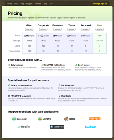
Our most recent update is the pricing page. While the site explains the purpose and features, the pricing page helps explain plans and the value offering between free and paid. It’s also meant to reassure visitors about what they get and that they are making the right decision (or not).
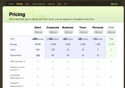
If you remember our previous sign up page, it was quite busy. The chart helped show the features, but it was hard to read. As we added new plans, it became even more complex. With our new pricing page, we decided to prioritize the items. First, people want to know the cost. We added a simple block to the top that displays each option, including the free plan in plain sight. The second priority was to show the difference between free and paid. Slightly below the chart, we designed easy to read blocks that reiterate the features between free and paid. This allowed us to get rid of the complex matrix and focus on detailed descriptions for each major benefit.
We struggled a bit on whether we should highlight or downplay the free plan. The trend lately is to downplay it, but we still feel free plans offer huge value for word of mouth and eventually grow into loyal customers. In the design process, we created some other revisions that we will test. Our goal is to give it a try for a week or two and measure the results. When it comes to improving conversion rates, it’s all about testing and revising. I will post a follow up with some more detailed statistics once we get through the tests.


