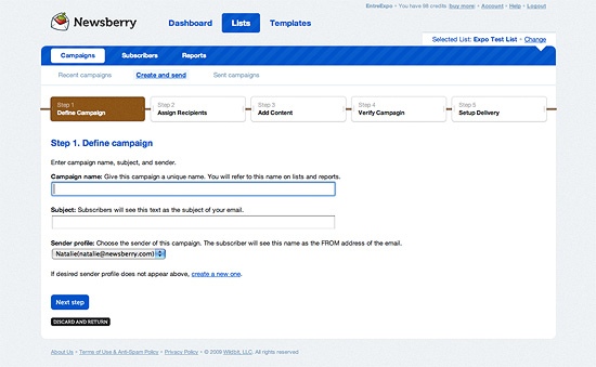
You may have already noticed that we redesigned Newsberry public to give it a fresh, clean new look. It’s Step Two of the effort we talked about earlier to update the application with not only new features, but also a clean-up of what’s there.
So, what’s different?
We have been thinking about a way to keep the old functionality intact, but adding a new fresh look to it. Thanks to our designer Gilbert, Newsberry got a completely new face. If you have been using Newsberry before and you liked it, we’re sure you will love it now!
What have we done?
- Moved Subscriber Lists to their own section at the top to make them more easily accessible.
- We’ve moved the tabs for Account and Help to the top so they are always visible.
- Moved our Help System to an outside application called Tender. This will allow our customers to post questions, comments and feedback as well as post private issues for our customer service.
These are only small changes which you would notice when you first log into your Newsberry account, but it does not stop here. During the makeover, we have completely redesigned navigation, buttons, tabs, modalboxes and much more.
For example, take a look at the redesigned “Create a Campaign” page:

Want to see for yourself? Login to your account or signup now!
The adventures of Newsberry do not end here. We have a lot more cool stuff planned for 2009. Stay tuned and follow us on Twitter to get the latest updates.

