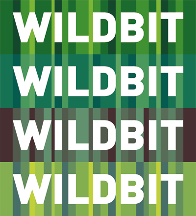
I’m pretty sure you noticed it by now, but we have a new identity. It was actually a very long and hard process, but it was worth the pain in the end. Want more insights? Keep on reading...
What does Wildbit mean?
This was actually the first question I asked Chris when we started working on the new identity. It’s a shame that I lost the chatlog from that day, but the answer was pretty close to this:
I don’t know :)
Yes, I hear a lot of people crying right now, but I’m sure there at lot of company names which don’t have a real meaning either. We even thought about a new name, but we ran into a wall quickly and we really like the word itself.
To define the emotional direction of the company, we asked our team members about what Wildbit means to them. Some quotes from that discussion:
I want Wildbit to be screaming-cool, hot and a bit geeky.
We should be fun, easy to communicate, but at the same time really serious about our business.
No infantile stuff like frogs and octopussies, right?
With some of this information in mind, the process started. We pretty much agreed that the colors should have a more earthy tone since the word “Wildbit” pretty much nails down a connection between the wild, or wilderness. So, after approximately 107442709 logo variations (that’s how it felt to me), I came up with the final result. Problem was, we could not decide on a color scheme because they all looked so great. We then decided to use them all because they work so well together.

The idea is that the stripes represent blades of grass and each stripe is perfectly aligned to the typeface. Hell yeah I love perfectionism.

I hope this removes the question mark above your heads. Watch our for the next post where I explain how our website design evolved.

