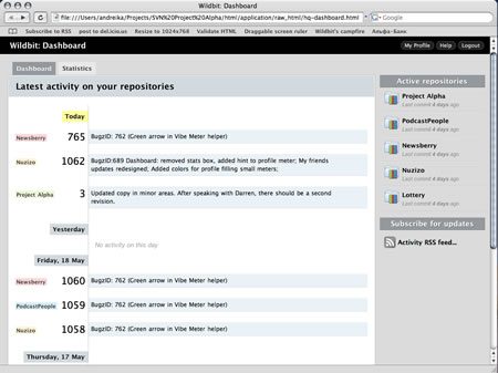
Design is often being evaluated as something colorful and beautiful. This is known as an “eye-catching” effect. This may be true and have great value for some consumer web-sites and applications, but when talking about web-applications is it really valuable to rely on visual beauty and trying to create the next design masterpiece? The more we design, the more we realize color is best used for communication, not just aesthetics.
As I started designing our next product, I released some initial mockups for the layout and visual design and started discussion with the team. Team's first impression was not that great, “the interface is nice, but design is very dull” — they told me. The only color in the application was from a few icons and small page items. But the more they looked at it, the more they realized the value.
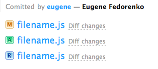
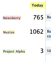
Since the Subversion management tool is very techie by definition and people are about to use it on a common basis, I decided not to use a color for the general design elements such as navigation etc. I have always known that color can be used for communicating priority, and for technical natured web applications this method can be utilized very well. In “Project Alpha”, I tried to take advantage of this as much as possible.
The main layout and navigation is extremely dull, with shades of grey and black. This creates an opportunity to use color purely as means of prioritizing content.


