This will be the beginning of a series about social software design, strategy, and implementation. The combination of this series will be used as a follow up to our 35 page Social Networks Report (PDF – 750K) from two years ago. This first post is about the use of dashboards and how they affect and motivate users.
The dashboard is used in many applications and is sometimes called many things. For the purpose of this article, a dashboard refers to an area of a site that offers personalized information to a user’s experience. We can see dashboards in social networks, project management tools, our own Project Alpha, and just about any interactive tool or resource.
The dashboard can be used to display:
- Most recent activity pertaining to personal interest
- Communication from moderators or site owners
- Quick access to primary tools and actions
- Current status and tips for getting started
In comparison to most screens on a site or application, the dashboard is arguably the most important. It’s the single resource that motivates and informs a user in regards to personal content. The success of a site relies on the ability of a dashboard to influence communication and provide quick access to content and tools.
Let’s review each section in detail.
1. Most Recent Activity
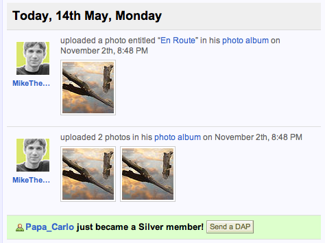
The most recent activity is a snapshot of what has recently happened. Depending on the application the content will vary, but the idea is the same. It is way to keep the user informed on what is going on throughout all aspects of the system, without the need to visit each area. It allows users to quickly decide which content is most relevant at the time and jump to the details.
Guidelines and Tips:
- Show only the information that is needed to take an action.
- Show relevant and personalized content based on the member’s habits or profile data.
- Organize items in one list, instead of creating separate groups of content. This allows quick scanning of content in one place.
- Create limits based on a timeframe or number of items. The dashboard is only meant to show the most recent or useful information, the rest can be found on other pages.


2. Communicating with members
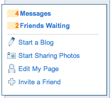
The dashboard is also an excellent way to communicate with members or customers. Since this is the most visited page, and in most cases the landing page when logging in, it creates an entry point for system notices or announcements. Announcements can include system updates, outages, new features, or survey requests. Eventually, this announcement pane becomes the “voice” of the system, which is extremely important for servicing and supporting a community or application.
Guidelines and Tips
- Position announcements in a prominent place with a slightly different look from the rest of the page.
- Offer the ability to hide the message or remove it automatically after a certain number of views.
- Keep the message concise and link to a page with further information.


3. Quick Access to Primary Tools
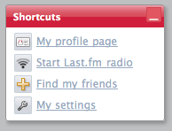
Aside from informational sites, the dashboard can provide quick and easy access to the most important tools that an application offers. The dashboard allows a little bit more explanation of each tool, in comparison to a basic navigation. This can help explain features to new users, then as they become more experienced, provide easy access for continuing use.
Guidelines and Tips
- Possibly provide a toolbar with the most common actions (post photos, find friends, etc).
- For new users, describe the actions in more detail and remove this information after the user becomes more experienced.
- Associate actions with relevant information. For instance, adding a song to your playlist from the latest activity.
4. Getting Started and Current Status
One of the most difficult aspects of joining a social network is getting started. I will post a follow up article to describe this process in more detail. To assist, the dashboard plays a big role. Since the dashboard revolves around activity and updates, it is usually “blank” when a user is first getting started. This creates a unique opportunity to get the member started with some room for explanation.
There are various ways to get the member started, but the most useful is to show either an example of what it could look like or displaying an action to fill in the void. For instance, if there is an area where the dashboard might show recent updates from friends, the initial action is to discover people and find some friends. Some applications or social tools require a series of steps to complete registration. A simple numbered process can help guide the user in the right direction. The focus of the design and copy should motivate the user to fill in the void, therefore getting relevant content that continues the interaction.
Guidelines and Tips
- Describe why completing the steps will benefit the user. Satisfy the “what’s in it for me?” question.
- Show examples of what the page could look like when it is complete.


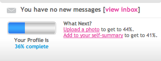
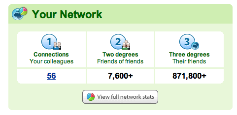
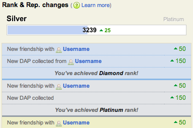
After a user has become an active member or completed the necessary steps to get started, the design motivation changes to displaying status. In social tools, it is important that members know where they stand in comparison to others. How many friends do I have? How large is my network? What kind of statistics does my profile have? And in some social networks, what is my reputation? This not only creates competition, but it also creates an awareness that contribution to the system matters. In turn, this creates motivation to continue the contribution.
Guidelines and Tips
- Use statistics, network status, or reputation to encourage action.
- Provide tools that members can use to set goals or feel like their contribution matters.
Conclusion
As you can see, the Dashboard plays a large role in getting users started as well as helping inform and motivate them as they continue to use the site or application. The key is deciding what is most important and using it as a guide for new users.
Do you have any other examples of great dashboards? Post a comment.

