Apple is known for their attention to detail and producing stunning user interfaces. Recently I found a nice typography touch in the Mac OS X interface that got me really excited.
I think any designer is familiar with term "ligatures". For those who are not, here is the definition from Wikipedia:
In writing and typography a ligature occurs where two or more letter-forms are joined as a single glyph. Ligatures usually replace two sequential characters sharing common components, and are part of a more general class of glyphs called "contextual forms" where the specific shape of a letter depends on context such as surrounding letters or proximity to the end of a line.
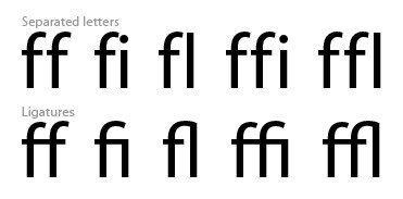
Most popular ligatures are "ff", "fi", "fl", "ffi", "ffl" and "fft". Here are some examples:

Now, take a look at some elements of Mac OS X UI:

Yes, they use ligatures system-wide! For me it's an amazing discovery. I think 99.99% of Mac OS X users don't care about such details, but they definitely care about the whole experience. And such small design and typography touches make the whole user experience much better. I want to share with you my favorite quote from Scott Forstall, Apple's vice-president of Platform Experience:
I actually have a photographer's loupe that I use to look to make sure every pixel is right. We will argue over literally a single pixel.
(Apple's New Calling: The iPhone at Time)

