Editor's note: Rian shared an update over on the Postmark blog after 6 months of using the roadmap he described in this post. If you're curious it describes how we moved from planning to execution.
I was recently hired at Wildbit to be Postmark’s first official Product Manager. As is common in smaller companies the team has been doing various product management activities all along, but they hadn’t had someone dedicated to the role (or a formal prioritization process). Ask any Product Manager what their biggest concern would be in my position, and their answer would probably be some variation of, “How do I start?”
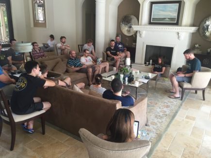
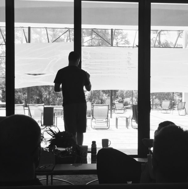
In my particular case, I got lucky. I joined the company a week before our yearly retreat. Since many of us work remotely, this is our chance to get together for a week of in-person work (and not work…). With that knowledge in mind I asked Natalie and Chris if we could use some of the retreat time to go through a full Product Discovery process for Postmark. So, armed with some whiteboard markers, a mountain of sticky notes, and one very enthusiastic team, we set off to plan out the next few months of our product. In this post I’d like to give an overview of what we did, why we did it, and how it’s going to help us (and our Postmark customers!) in the coming months.
Introducing Product Discovery
As a new Product Manager on an existing product the hardest thing to do is getting up to speed on the ins and outs of the product, the team, and the current roadmap. You can dig deep into the product itself, but that will only get you so far. For a truly deep understanding of the product and its vision, you need to understand what your product is useful for, who it’s for, and how you plan to make it better. That’s where Product Discovery comes in.
I won’t go into detail on the Product Discovery methodology here (you can read my article about it on A List Apart for more background), but suffice to say that there are three basic steps involved:
- Step 1. Frame the problem (understand user needs and business goals)
- Step 2. Explore and assess multiple solutions (figure out the most important areas to focus on)
- Step 3. Prioritize and plan (come up with a specific plan to address the most important needs)
We set ourselves a very specific goal we wanted to accomplish with this process: we absolutely needed to have a prioritized roadmap that can last us for the next six months or so. If we came back from the retreat without that, we’d consider the process a failure (spoiler: we luckily didn’t fail…). It’s important to note that this roadmap was never meant to be set in stone. It remains extremely flexible (and has already changed a bit), but it helps us to visualize a path towards our vision. And it gives us a holistic view of what we’re working on so we can accurately assess the dependencies in the product and the risk/reward of making changes to the roadmap. If a new idea comes up, the roadmap gives us a framework for discussing it in context—if we focus on this now, what will we have to stop working on? Is it worth it?
So with this framework and goal in mind, we set off on our journey, starting with… Personas.
Personas, oh my
I’m a big fan of the recent move away from user stories to job stories to design better products. Alan Klement provides a good overview of this method, which we’ve started to use as well, in Designing Features Using Job Stories. That said, I’m worried that personas are on the verge of extinction as collateral damage of this evolution. We can’t let that happen. Alan explains his issue with personas as follows:
The biggest and most pertinent problem with Personas is this: Personas are imaginary customers defined by attributes that don’t acknowledge causality. These attributes, generally in the form of demographics, do not bring a team closer to understanding a customer’s consumption, or non-consumption, of a product.
The characteristics of a Persona (someone’s age, sex, race, and weekend habits) does not explain why they ate that Snickers bar; having 30 seconds to buy and eat something which will stave off hunger for 30 minutes does explain why.
The problem with this argument is that it refers to marketing personas, which are generally not very useful for design. Marketing personas are usually based on segmentation data, and ends up being mostly about demographics that cluster similar groups of users together.
But we shouldn’t confuse marketing personas with design personas, which are specifically created to guide the development of product features. How are they different? Well, first and foremost, design personas are based on needs, goals, and dimensions that have a direct impact on their interaction with the product. In other words, they incorporate causality, which takes care of Alan’s gripe.
So while I agree that job stories are much better than user stories for product design, I see them as a valuable augmentation to design personas, not a replacement for them. There is still a huge amount of value in personas. They have names and faces, so the whole team can picture them. As opposed to a mythical “average” user, they are solid people we can imagine using our product to achieve their goals. This is helpful because by focusing on individuals that are closer to the edges of the experience, instead of the average, we’re able to cater design for a larger portion of the user base.
In the documentary Objectified, Dan Formosa from Smart Design says, “What we need to do to design is to look at the extremes. The middle will take care of itself.” As an example, he talks about how they once designed garden shears specifically to cater for people with arthritis. They knew that if the shears worked for that “user”, it would work well for everyone. That’s the power of personas.
I understand and agree with the concern that personas can sometimes be oversimplified caricatures of users that don’t take specific situations and actions in consideration. Without proper research personas also tend to be be shallow and not very useful. But those are dangers that are easy to avoid. Remember that personas aren’t prescriptive, they’re descriptive. You can’t identify a persona and then try to predict people’s behavior off it. But with solid research and analysis you can use personas effectively to help focus development efforts on target users, and help define what features should be included in (and just as importantly, excluded from) the product.
So with that as background, we were very serious about making this a useful exercise, and that meant focusing on the things we need to know about our users in order to design a better product for them.
We started by discussing all the different user needs we try to address with our product. That led us to a product vision and some guiding principles, that we continued to refine throughout the week. As it stands, our product vision is this:
We make it easy to reliably deliver time-sensitive messages to our customers’ users.
This, along with our guiding principles, led us into a collaborative exercise to determine the primary drivers that affect how our users view the transactional messaging in their apps.
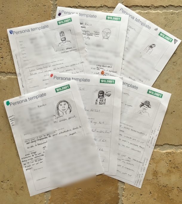
From there we broke up into groups and filled out some templates to help us understand some specific things about each persona:
- What messaging aspects do they care most about?
- What are they trying to accomplish with their messaging?
- What is the business problem they’re trying to solve?
- What do they need from a messaging provider?
Here are the initial drafts we came up with. We discussed each persona as a team and each group made changes based on the feedback they received:
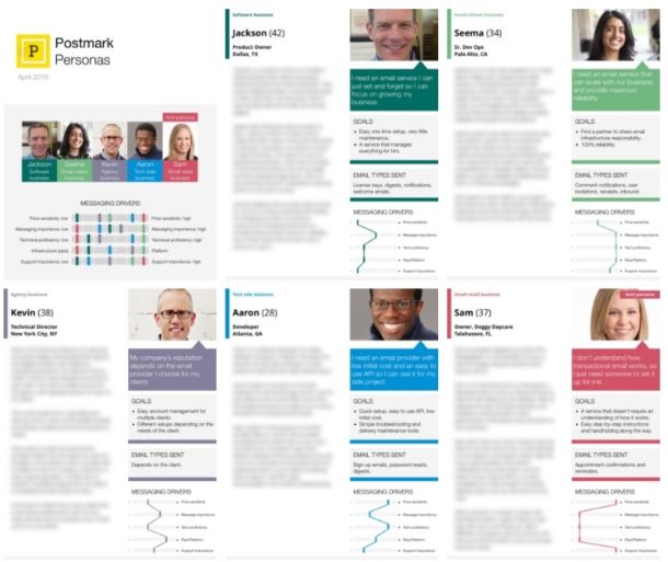
At this point we moved on from Personas to the next step, but my work wasn’t done. After I got back from the retreat I created our final personas based on the sketches we made together:
Customer journey map and feature ideas
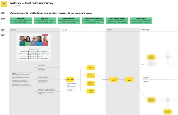
The next step was to come up with an ideal customer journey map, based on our target personas. Postmark might seem like a simple product from the outside, but it’s incredibly complex. So what I thought would take us a couple of hours ended up taking up most of an entire day.
Once we had a good understanding of the journey our next step was to go through each phase and discuss how we can make it better. This is where we started to come up with feature ideas. It took a while to get to this solution phase, as it was important for us to do all the background work first. But now it was time to open the floodgates and ask ourselves, how can we make the product better for users at each stage of their journey with us? We used a lot of sticky notes to answer that question…
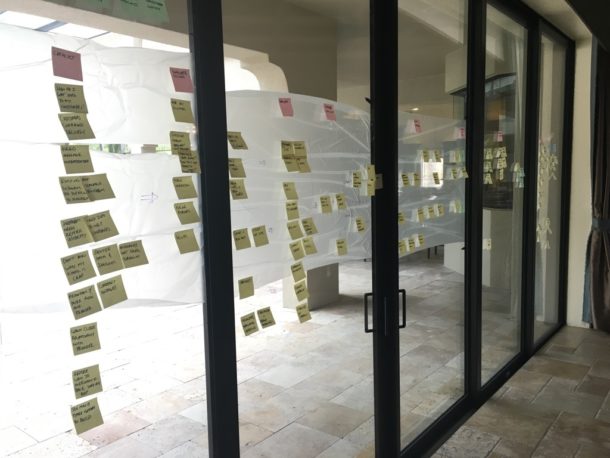
It’s worth noting that there was no prioritization at this point—only ideas. This allowed us to think freely about all the things we wanted to do for our customers, and being comfortable that prioritization would happen later on.
Once again, after the retreat I wrote the journey up into something a little more useful. Here’s a small part of it, just so you can see what the end result looks like:
Once we were done with the journey map, it was time to move on to what I felt was the most crucial part of the process: creating a prioritized roadmap based on our target personas and ideal customer journey. The methodology I chose to go with is called agile story mapping…
Agile story map
Storymapping is having a confusing year, so allow me to digress for a minute. Agile story mapping has been around for quite a few years (see, for example, How to create a user story map). In contrast, Storymapping—which has nothing to do with roadmaps and everything to do with user journeys—recently became a thing as well (see The User’s Journey). So I should clarify that for this exercise we were specifically focused on agile story mapping, which is a technique to prioritize a roadmap based on dimensions of customer journey steps and prioritization. Confusing, I know. We definitely need different names for these things.
Anyway, agile story mapping takes a user journey and then prioritizes product releases based on each of the customer journey phases. We used a simplified version of the process, which, at a high level, looks like this:
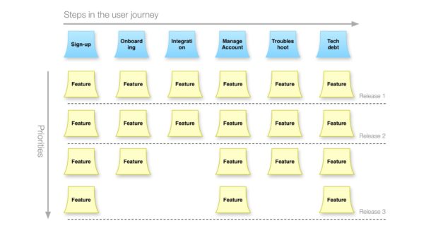
There are many benefits to this approach, but to me the most important one is that it results in a balanced roadmap. Instead of just focusing on a single aspect of the product, we ensure that we improve every aspect of the journey—or at the very least, recognize the trade-offs we make if we decided to focus on a particular area for a while.
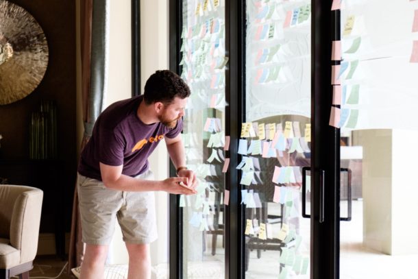
So after we created our journey map, I spent a few hours re-arranging our sticky notes so that our primary user activities ran along the top, and all our feature ideas were arranged in a big blob underneath that.
We then proceeded to do prioritization in two phases.
Phase 1: Voting
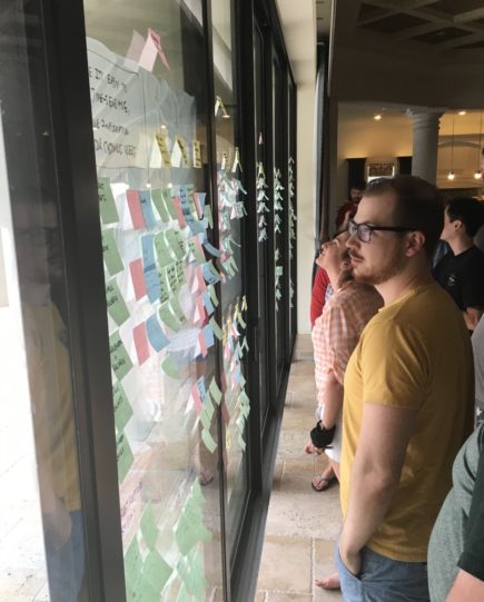
First, we gave each person three chances to vote for the features they felt were most important to our customers. This is such an important part of the process. Everyone on the team has a different perspective on the product based on their roles, so this is a way to make sure we take all those varying experiences into account when we prioritize features:
Phase 2: Walk the wall
Once this was done I spent some time prioritizing the sticky notes based on the voting. But this was only the first phase. The next day we took a smaller team and starting “walking the wall.” We painstakingly went through each feature, discussed it, moved it around based on dependencies, and then did it all over again. A few times.
It was exhausting, but at the end of that we all stood back, observed our work, and felt good about where we ended up. We were done.
Et tu?
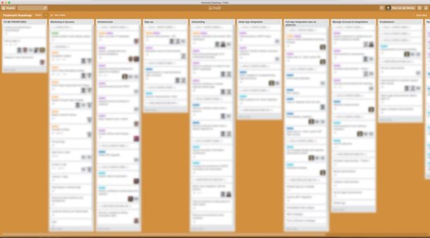
Well, almost done. As pretty as sticky notes are, they’re not much use to us back at the retreat house. We had to document that somewhere. So I started to work on a Trello board that now serves as our global prioritized roadmap for the next few months. Again, this can (and does) change at any time, but we know that right now, with the information we have, we’re working on the right things. Here is an appropriately blurred-out version of the roadmap…
So what’s next? Well, execute, of course! We’ve already started working on some of these features and you’ll start seeing them in Postmark soon. It ended up taking us almost 4 full days, but I love all the things we were able to accomplish collaboratively as a team during that time:
- A clear idea and shared understanding of who our target customers are and what’s important to them.
- A holistic journey map that helps us make sure we focus on every part of a customer’s experience with us.
- A roadmap that is deeply rooted in user needs and how we can make our customers more successful.
So how do you make a roadmap in 4 days? Buy a ton of sticky notes, go away for a week with your team, and follow some variation of the process we outlined here to focus relentlessly on customers and how to make them successful. And if you need help to get started, we decided to include some resources to help you out. Below are links to download templates for Personas and User Journeys in OmniGraffle format. We’d love for you to use them and give us feedback on how they can be improved.

