
A little over a year ago, we had 4 marketing websites built with 4 different frameworks or CMSs, and it was a mess. As the team had grown, publishing became a nightmare — nobody really knew how to access or update any specific page or a part of a website. We had some work to do. Within a few months we researched, picked, and migrated to a single CMS; moved marketing websites to a single hosting platform from multiple scattered services; and created a library of modules that is reused on all of them. This massive project isn’t completely over yet, but enough time passed both to confirm that we made a right choice and to see some of its issues.
Short history of marketing websites at Wildbit
To see problems with our previous setup and better understand our priorities and choices, we need to go back in time and explain how things turned the way they did. A year after I joined Wildbit in 2004 we launched a blog called Tidbit (see what we did there?) at then-popular service Typepad. 2 years later we redesigned both our website and blog and migrated them to a self-hosted WordPress installation. Nobody in our team really knew WordPress or was willing to learn it, so we outsourced its configuration and setup. In the end of 2009 we redesigned it again, while staying at the same WordPress installation — this design stayed with us for over 5 years. As you can imagine without deep WordPress knowledge we were subjected to all of the problems it is usually blamed for — lack of security, comments spam, breaking updates, etc.
We aren’t in the business of building WordPress websites and as a small team have to focus on our apps, so it was clear that we didn’t want to use it again on our products websites. We built them as parts of our product apps and created blogs at Tumblr (which wasn’t a strange choice in 2009). This decision let us reduce maintenance time and improve stability, but brought its own problems — any change to a marketing website required a developer, and if any of our apps experienced an interrupted service its public website would be unavailable too, so we wouldn’t be able to direct users to a status page or a support website. Tumblr also turned out to be a horrible choice for collective blogging with its primitive user management, non-existing archives, and lack of control over front-end and performance.
We definitely needed a better solution to use across all of our public websites.
What does a product website need?
During the summer of 2015 we dedicated some time to redesign the Wildbit website and to also find a better solution for running our websites, with a hope that we can reuse it for our products later. So what exactly did we need from it?
- Flexible structure of content. A CMS that can run marketing website, landing pages, blog, guides, API documentation, and a jobs section under a single roof. This is not a trivial task and most CMS’s can’t handle it.
- Our whole team should be able to use it. Some of our team members are less technical than others, so publishing a blog post shouldn’t involve committing Markdown to a Git repository and then SSH’ing into a server for deployment. It would also be nice if we can limit team members’ access only to those sections that they need.
- Full control over templates. Not only did we need to build various layouts for all the sections, but we were also fed up with all the extra markup and JS bloat of hosted services. Solid front-end performance, optimization for search engines, and meta information for social media aren’t always possible or easy without full control.
- The ability to create visually engaging layouts without any coding. Some of our blog posts and guides use a good share of differently sized images, pull quotes, code samples, and videos. It should be easy to upload assets and format page in an interesting way without writing any code.
What we considered?
I spent a whole week installing different CMSs, reading their documentation, and importing our blog posts archive to give them a try. Most of them didn’t work out not because they are bad per se, but because we had very specific requirements or were a wrong audience. Here are some options we considered.
WordPress
Even while we didn’t have the best experience with it, we had to consider a CMS that runs 1/4 of the web. Our plan was to outsource hosting and security to WPEngine so we wouldn’t have to worry about it. As an incredibly powerful platform WordPress has plugins that make creating unique content structures possible, but in a nutshell it was still a blog engine. I also don’t know PHP and never really enjoyed working on WordPress themes, so it was hard to get excited about investing so much effort into this project. The rest of the team complained about its clunky UI, too. So even while we knew it would be possible to fulfill all our needs with it, we decided to look for other, more exciting options.
Squarespace
After launching DeployBot in 2013 we had a short stint with Squarespace. They have an extensive development platform, so our expectations were pretty high — modern, highly customizable, and hosted service sounded great. Reality turned out to be way less exciting. The editor was unpredictable and cumbersome to use, layout flexibility isn’t really there, the templates are loaded with a ton of JS, and overall it felt really slow. We had the DeployBot blog hosted there for a little over a year, but in October of 2015 it was migrated to our new CMS of choice. (I guess we aren’t the right audience.)
Ghost
Our founder Chris really liked the writing experience in Ghost CMS — everything is very clean, and their default template looks great on different platforms. We gave it a try, but it wasn’t a good fit. A list of more than 250 entries in the admin area without any filtering or sorting was a show-stopper, same as a limit of just one image per entry. It may be a good choice for a personal blog, but in our case it didn’t scale well.
Statamic
We played with an idea of a flat file CMS for a bit and Statamic is probably one of the best known options out there. In the end we decided that the way it handles images, doesn’t support complex layouts, and lacks entry preview wasn’t a right choice for us.
Siteleaf
The concept behind Siteleaf is great. You build templates that will be compiled with a static site generator Jekyll, team uses a nice modern web app for posting entries, and then Siteleaf generates static files and deploys them to your servers — all of the benefits of a flat file CMS without any downsides. I really wanted to go with it, but their UI wasn’t a good fit for our archive filled with a decade of blog posts. (They were working on improving it back then, so maybe now all the problems I faced do not exist anymore.)
Our choice — Craft CMS
I remember searching for and reading discussions on CMS at Designer News and Hacker News, and everyone was really passionate and excited about the same CMS — Craft. It was relatively new so I had never heard about it before, but after some research I found out that it’s built by Pixel&Tonic, the team behind some of the most popular plugins for ExpressionEngine. They are no strangers to this business and when EllisLab slowed down EE development, they stepped up to build their own CMS.
Craft is different from most CMSs. It doesn’t include a default theme, because there can’t be one. It doesn’t make any assumptions about your content or its structure. You start with a blank slate, create fields for types of content you need, then organize it into structures. Once you've done that, you can move on to design and build the actual pages. Architecting your website from scratch is very different than taking a prefab and trying to shape it for your needs.
So what’s so great about it?
Twig
We don’t use PHP in our products, so I was cautious to give another CMS written in PHP a try. That said, after reading Twig for Template Designers I was almost sold. Twig is a modern template engine for PHP, and it’s great. It doesn’t allow PHP to be used inside templates, so they always stay really easy to read while providing enough power for any use case. (For advanced scenarios Craft has an API and can be extended with plugins.)
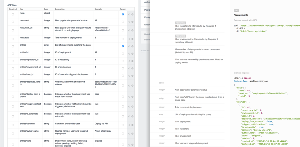
Probably the most wild thing I wrote in Twig was a function converting a table of API parameters into a JSON sample for the DeployBot API Docs. Not really what Twig was invented for, but pretty cool anyway.
Matrix
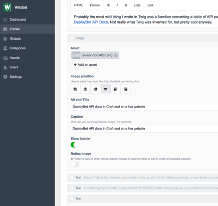
This is the feature convinced me to go with Craft. Matrix provides a new level of content flexibility and control over the markup. Think of it as a WYSIWYG for content blocks— you create blocks for various types of content with your own markup, then let authors build custom pages with them. We use it not only for formatting blog posts with pull quotes, images, and code samples, but also for building completely custom landing pages for our products.
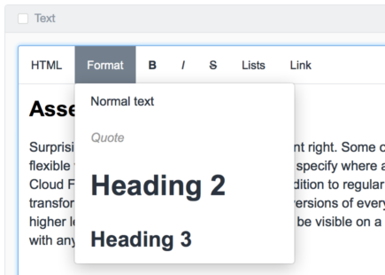
Combining Matrix with a customized WYSIWYG editor toolbar gives us complete control over resulting markup. We replaced some of the editor’s toolbar formatting tools with custom Matrix blocks and simply deleted those tools we never plan to use. For example, we have a custom Matrix block for images that lets us align them in different ways and provides optional captions, or a code block with a programming language dropdown so we can highlight syntax in a correct way. All of these elements were removed from editor’s toolbar so nobody can use them by mistake inside the post.
Assets management
Surprisingly few CMSs do assets management right. Some of them just upload your image and leave it at that. Craft is really flexible with assets — not only does it let you specify where a specific photo should go (it supports Amazon S3, Rackspace Cloud Files, and Google Cloud Storage in addition to regular directories on your server), but also if and how it should be transformed. For instance, we generate two versions of every image for regular and Retina screens, but Retina images get a higher level of compression as artifacts won’t be visible on a downscaled image anyway. This level of control wasn’t possible with any other CMS I tried.
The most unique use case
Earlier this year we announced a new Postmark status page — a real-time dashboard of system availability, service statuses, and delivery times. It’s built as a Node.js and React app, but we needed an admin area for our customer success team to post updates during service interruptions. After considering various options we decided to use Craft even for that. An official Element API plugin creates a JSON API for our updates that status page pulls data from, and the Buffer plugin posts the same updates to our Twitter account. This lets our team use a single control panel for updating the status page, publishing blog posts and guides, and managing our marketing landing pages. Pretty good for a single CMS!
What’s not so great?
After using Craft for a year I can point to only two places that can get some improvement, and I know for a fact that their team is working on both of them.
- Currently there is no way to migrate database changes between development, staging, and production servers. We created an internal workaround involving two databases and a Bash script, but it still requires a lot of manual work and very error-prone. Luckily, the Craft team knows about this problem and added content migrations to the next version of the CMS.
- Not really a problem, but I wish performance was a little better. On average our TTFB (time to first byte) is around 200ms, but some pages that aren’t cached take up to 400-600ms to generate. Upgrading to PHP 7 is supposed to speed things up a little, and next version of Craft is going to be 2x faster!
It’s great to see that CMS is actively developed and personally I can’t wait for version 3 to ship. For us, all the great things about Craft definitely out-weight these downsides.
Reusing code across multiple websites
At the moment we’ve already migrated the Wildbit, Postmark, and DeployBot sites to Craft. (Beanstalk is in a queue, as it’s one of our oldest and most content-heavy websites, and migrating and reviewing the content is very labor-intensive.) While all landing pages are completely unique, our blogs and guides share a lot of similarities. They aren’t so similar to share the same template files, but similar enough to reuse the same elements, layouts, and modules. Finding a way to reuse code efficiently across 3 websites is an interesting problem to solve.
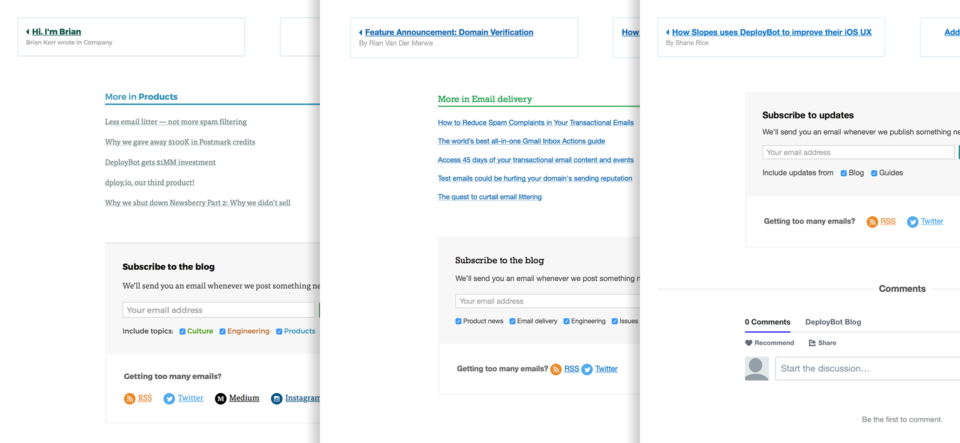
We started with a “golden standard” set of templates, CSS, and JS to be reused across all of our websites. Whenever we’ll improve any layout or element, changes should be manually synced back to “golden standard” repository and all other projects that rely on it. As you can guess this approach has proven to be inefficient and hard to maintain.
Right now I am working on a library of universal components and helpers stripped from any branding that we use on all of our websites. Every component can be extended with brand-specific design through automatically available BEM modifiers. There is still a lot of work on building this library, and then we’ll need to refactor existing sites with it, but this approach must scale and age much better. I plan to write more on this when the library is ready and open-sourced.
Summary
So far we’ve been really happy with our choice. It lets us run our websites with all their sections and satellite apps from central places while providing incredible flexibility and stability. Working on new updates is always a joy, and we can’t wait to give an upcoming version 3 a try. If you build websites for clients or run a public website for your product consider giving Craft CMS a try.

