Wildbit Blog | Products https://wildbit.com/blog/topics/products/feed.atom 2024-11-18T11:17:53-05:00 https://wildbit.com/images/favicon.ico?20150716 People-First Jobs: what we learned about the evolving landscape of people-first work https://wildbit.com/blog/insights-from-people-first-jobs 2021-10-05T11:16:00-04:00 2021-12-07T12:05:57-05:00 Chris Bowler chris.bowler@wildbit.com https://chrisbowler.com Almost two years ago, we announced that we were going to launch a new kind of job board, People-First Jobs, focused on helping job seekers find companies who put people first.

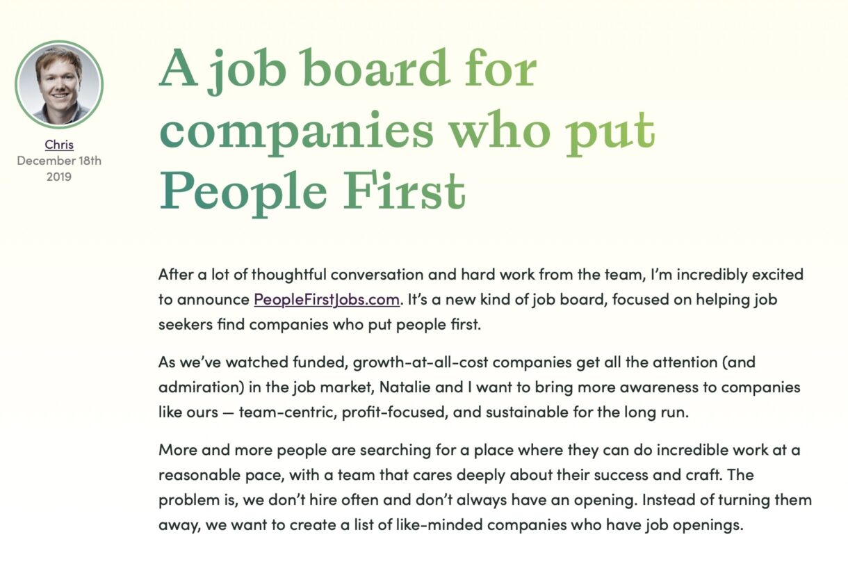
A screenshot from our initial announcement blog post.

Our December 2019 announcement… just a few months before that other thing happened.


Then the pandemic happened.

At first, we hesitated: the job board was ready to be shared with the world, but we didn’t want to feed off the crisis or add to an environment of stress and uncertainty.

Later, when it became obvious that the landscape of financial stress, layoffs, and hiring freezes was leading people to hang onto jobs they were unhappy in, we realized that People-First Jobs could make a meaningful contribution by highlighting the people-centric companies that were still hiring. So we launched as a free platform in April 2020.
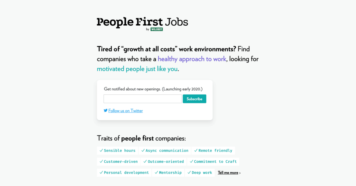
A screenshot of the first design of People-First Jobs.

The initial version of People-First Jobs.

Flash-forward to October 2021. The economy is re-stabilizing, but something different is happening: instead of staying in roles that make them unhappy, workers are quitting jobs in unprecedented numbers, and companies are struggling to find talent to replace them.

Things that used to be differentiators, like remote work, are now commonplace. In a candidate’s market, companies have to do more to draw in workers than just list cool perks: they need to prove that they put people at the center of their culture.

At Wildbit, we want to inspire more companies to be people first. Of course, there’s no one right way to run a people-first company—it will look different to everyone. But if we can inspire companies to have a healthier approach to business that supports their employees, that influence will ripple out to people’s local communities and ultimately make a bigger impact on the world.

And almost 18 months in, we’ve learned a lot from running People-First Jobs. The board has evolved into a paid platform, and we continue to iterate and improve it to connect the companies looking for value-aligned candidates with job seekers looking for companies where they can thrive.
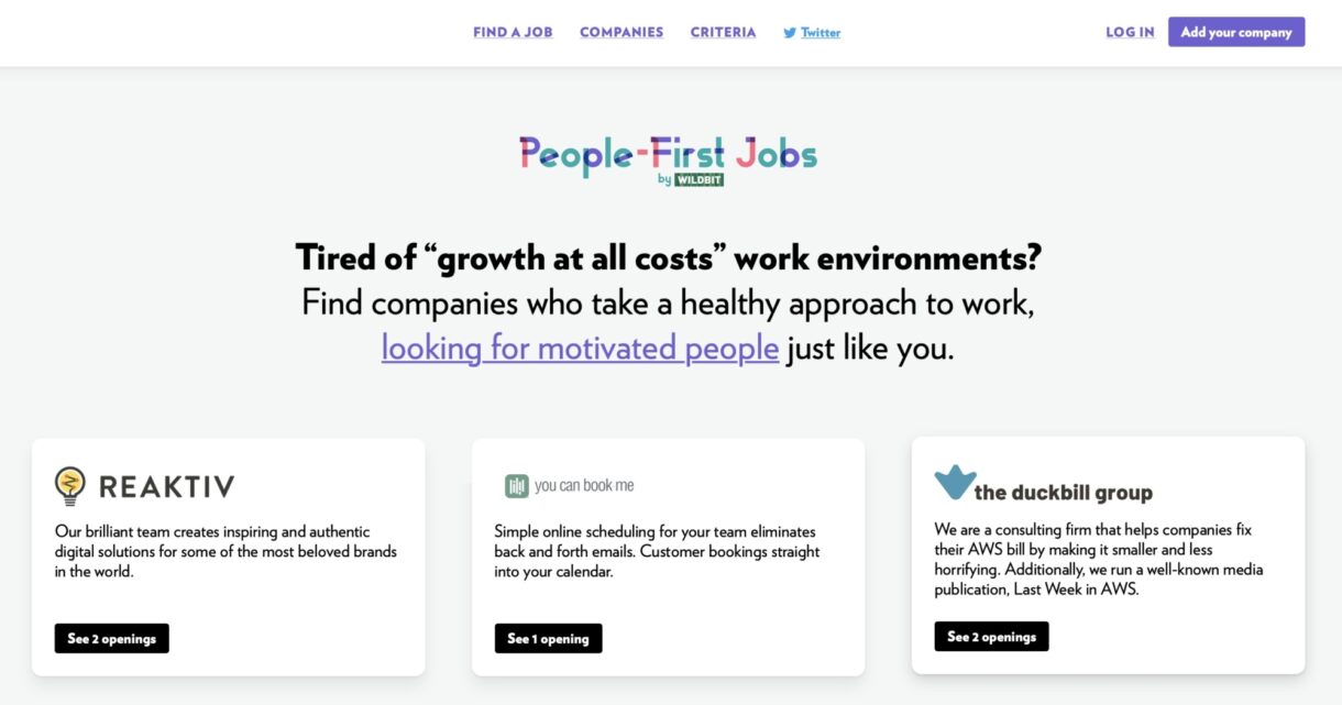
A screenshot of the updated design of People-First Jobs.

People-First Jobs today.

I want to share my learning from the last 18 months with you. If you are interested in learning more about treating your team well (even if you’ve never heard the term ‘people first’) or you are a job seeker who wants to find a people-first company and a more fulfilling career, this is for you.

What do job seekers want and need today?

Over the last year, I’ve had dozens of conversations with job seekers to find out what’s most important to them.

Most of the people I talk to are already employed, but they also seem to always keep their eyes open for a job that will enable them to be the best version of themselves. They want to be more in control of their workday and more engaged in their career. So they’re more selective in the companies they apply to.

1. Candidates want an accurate picture of company culture

The most important thing for job seekers when considering a position is an understanding of a company’s culture. They want to see personal value alignment and benefits that support their needs, as well as a clear picture of what day-to-day life at a company looks like.

How we are addressing this need with PFJ: companies on People-First Jobs are vetted and have a company profile so candidates can determine if a company is a good culture fit.

The vetting process is robust. We ask companies to speak to a list of criteria that cover various aspects of company culture like diversity and inclusion, schedule flexibility, and remote work options. Companies aren’t required to fulfill all of these, or even in a particular way. There’s no rulebook as far as people-first work environments are concerned. We’re all figuring it out as we go. But these criteria generally indicate a people-first ethos.

When a company joins the platform, its profile reflects the criteria we cover. So job seekers know we’ve done the vetting process for them, and they can get a clear sense of what it’s like to work at a company.
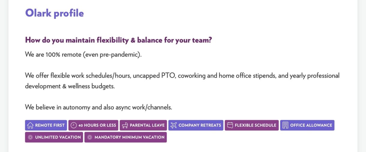
A screenshot of Olark's profile on People-First Jobs.

A glimpse into Olark’s company profile

2. Job seekers expect companies to challenge work culture norms

The people looking to People-First Jobs for their next gig care deeply about work culture and know it’ll be tough to sift through LinkedIn or Indeed to get what they want. They expect their next company to adopt a modern way of doing things that puts people at the forefront.

How we are addressing this need with PFJ: we make sure to invite and include companies that often experiment with new ways to be people-first. Consider some of these examples:

  • Buffer continues to evolve their paid time off policy. After an unlimited vacation policy caused people to take the same number or fewer days off than the two-week American standard, they implemented a minimum vacation policy to encourage people to use their paid vacation.

Here at Wildbit, we’ve been experimenting with reducing the power imbalance in the hiring process. In a job search, it often feels like all the authority and power lies with the employer, who holds the key to a candidate’s financial security as well as unwritten expectations that didn’t make it into the job description.

When we hired a new marketing manager earlier this year, our head of marketing, Justine, experimented with new ways to extend our people-first approach to everyone who pours their time and energy into their job applications. She used a public flowchart, a “living FAQ,” and meaningful dialogue to create a better experience on both sides.
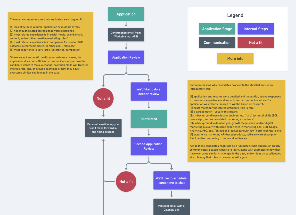
An image showing the hiring flow chart used in a recent hire at Wildbit.

The flow chart that helped explain the hiring and decision-making process.

Ultimately, it was a lot more upfront work, but it gave more balance to both sides and resulted in a more efficient and effective hiring process. And we believe it’s better in the long run for everyone involved.

It’s these kinds of changes that job seekers expect to see from their ideal company. On People-First Jobs, we want to encourage companies on their journeys to being more people first. Of course, we can’t enforce anything, but we hope to influence how companies hire and retain employees by setting examples and providing resources over time.

3. Applicants care about salary equity and transparency

Another topic that comes up when I’m talking to job seekers is salary transparency. Job seekers feel it’s a waste of time for both sides to go through an intensive hiring process just to get to the end and have very different salary expectations.

How we are addressing this need with PFJ: very simply, we have an optional field for companies to indicate salary ranges in the job description. That single line can tell someone a lot about the expected seniority of the role and whether it meets their expectations. Then applicants can self-select out if it’s not worth their time.

Beyond the job board, some of the PFJ companies are experimenting with salary transparency:

  • Buffer’s salaries are public, to keep the company accountable to gender and race bias.

  • Tortuga opts for salary formulas to reduce bias. Standardizing how salaries are determined gives transparency into the process while allowing employees to keep their personal finances private.

  • Niteo uses a Salary System to set their salaries as objectively as possible.

  • Recently, location-agnostic pay has been an increasingly hot topic—a policy we implemented at Wildbit on July 1, 2021. People want to be equally valued for their work regardless of where they live.

There’s no one way to compensate employees well, but as companies experiment with different approaches to support their teams, like-minded candidates will flock to them.

Want to hear more about the companies on People-First Jobs? Sign up for our email list to learn more!

People-First Jobs makes it easier to hire and retain value-aligned talent

Replacing an employee is incredibly expensive. Considering the costs of lost productivity without a team member, missed opportunities, and resources spent looking for candidates and onboarding a new hire, it can cost companies anywhere from 30–50% of an employee’s salary for entry-level roles to 400% for highly skilled jobs. So it’s essential to do what you can to hire the right people from the start and implement people-centric policies to retain them.

In our experience so far, People-First Jobs has acted as a platform to get better candidates, raise public perception, and build community with like-minded companies.

1. Access to intentional job seekers

The unique approach of People-First Jobs benefits both sides of the audience. Yes, job seekers benefit from working for companies that have a healthier approach to work. But employers also get higher quality applicants from People-First Jobs.

Many job seekers that come to People-First Jobs aren’t looking for just another job: they’re looking for a chance to be the best version of themselves. They care about value alignment. So they’re also often loyal employees once they find the right fit. And long-term employment is better for everyone.

2. Learning from other companies

Being people-first isn’t easy. It’s a commitment that guides every department, policy, and action. Every employee needs to live out that philosophy—and company leadership needs to set examples and provide resources for success.

For companies, People-First Jobs is not just a job board. It’s a community of like-minded companies tackling the same challenges. If we can collaborate on solving these problems, we can work together to develop better companies that are better to work at.
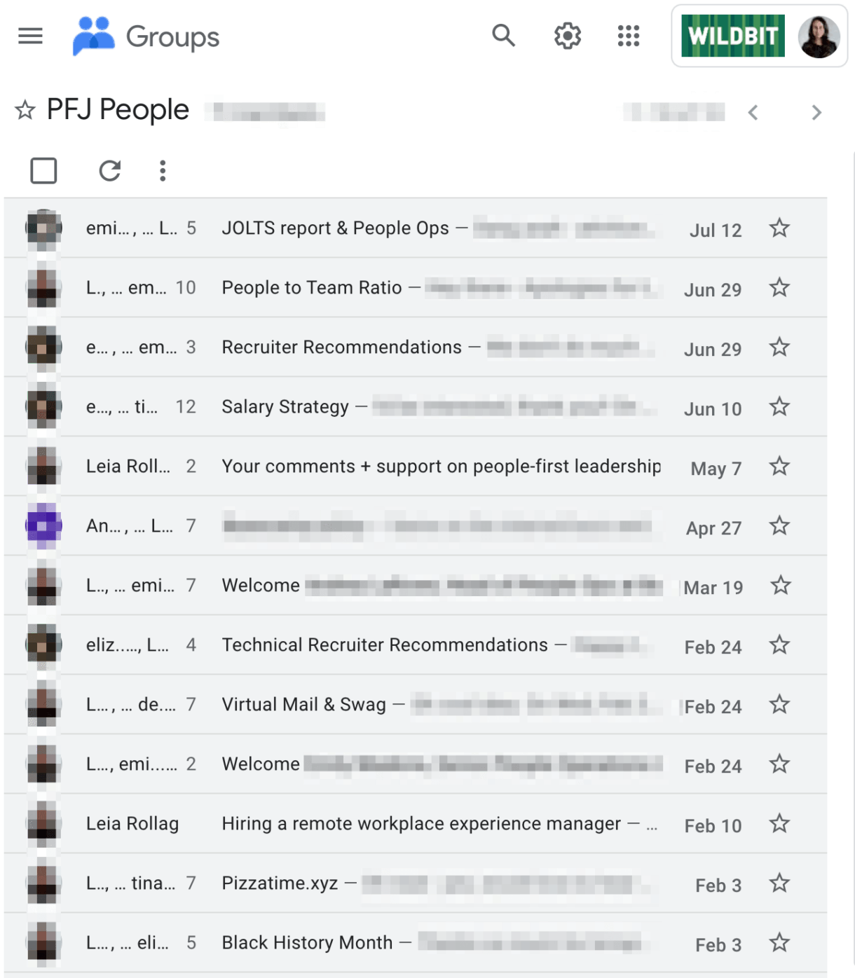
A screenshot of email conversations between folks at different companies included on People-First Jobs.

An example of conversations happening between some companies on People-First Jobs.

Right now, the community aspect is informal, but we’re considering how we can make it a more official part of the membership so companies can connect more easily.

3. Gaining positive public perception

Being recognized as a great place to work draws in both candidates and customers. One Forbes writer says she flies Southwest Airlines because she knows employees are happy. I’ve also stopped using products when I hear about bad work culture (excuse me while I go cancel my Amazon Prime account).

Companies already display badges of recognition, such as from Great Place to Work. Being on People-First Jobs surrounded by other great companies validates that a company’s list of benefits isn’t just talk.

Some companies already display their People-First Jobs membership on their Careers pages, and we’ll likely offer badges at some point.
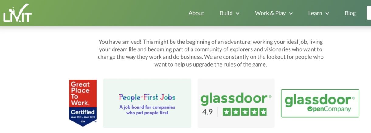
A screenshot of the careers page for Liv.it.

The Livit team added a People-First Jobs badge to their jobs page.

Want to see your company here? Tell us more about your team and how you put your people first!

We’re in a unique time

Employees have burned out more than ever over the last year and a half. Women are leaving the workforce because childcare options are less available than they were before the pandemic. Situations such as this have put us on a faster trajectory for the creation of more remote-first companies and more human companies.

Employees need the support of their companies to live sustainable lives. The more we can create people-first cultures, the better off we’re all going to be.


Interested in hearing more about these companies and their job openings? Sign up for our email list to learn more!

]]>
Accessible Palette: stop using HSL for color systems https://wildbit.com/blog/accessible-palette-stop-using-hsl-for-color-systems 2021-09-16T13:23:00-04:00 2021-09-22T09:55:00-04:00 Eugene Fedorenko eugene@wildbit.com https://efedorenko.com Recently, I set out on a mission to reconstruct a color system in Postmark. This project addressed several problems with our design system, involved a lot of research, and even required building a few custom tools. Now that this project is finished, I want to share the most important lessons I learned about color and present a new design and accessibility tool Accessible Palette born out of this work.

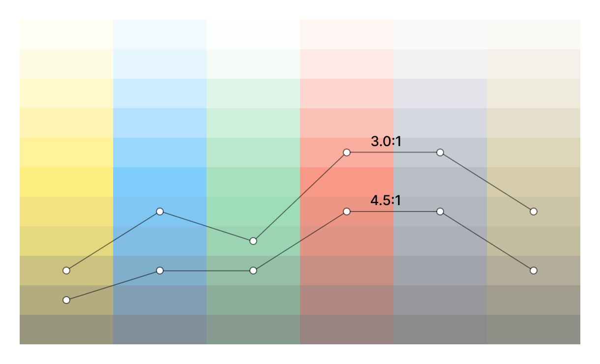
The main problems with our old palette were inconsistent perceived lightness of colors (blues and reds are much darker than yellows and greens) and unpredictable contrast ratios between color variants. When picking a color pair, we couldn’t easily tell if it would meet the recommendations from Web Content Accessibility Guidelines (WCAG) and had to manually check the contrast ratio. (Or, most likely… not check.)

Postmark Color System v1 with inconsistent lightness

Postmark Color System v1 with inconsistent lightness

Contrast ratios against white background

Contrast ratios against white background

In fact, both of these problems were caused by the inherent fault in the HSL color model and lack of support for better alternatives in the design tools. While HSL and HSV are fine choices for choosing a single color, they’re not suitable for building a color system, as they simply transform the RGB model and ignore the complexities of human perception. To see what’s wrong with them and find an alternative, we need to look at color theory and consider other color spaces.

Stop using HSL for color systems!

The RGB color model reflects how screens work and is not trying to be user-friendly or intuitive. Instead, in the 1970s, researchers came up with HSL (Hue, Saturation, Lightness) and HSV/HSB (Hue, Saturation, Value or Brightness) models as alternative representations of RGB, based on how humans think of colors. The intention was good, but they had to trade off perceptual relevance for computation speed, as more sophisticated models would have been too computationally expensive for that time. The resulting HSL and HSV models are easy mathematical transformations of RGB that don’t reflect a human perception of lightness or saturation.

Consider colors in this scale with the same Saturation (100) and Lightness (50) in HSL:

HSL gradient with Saturation set to 100 and Lightness to 50

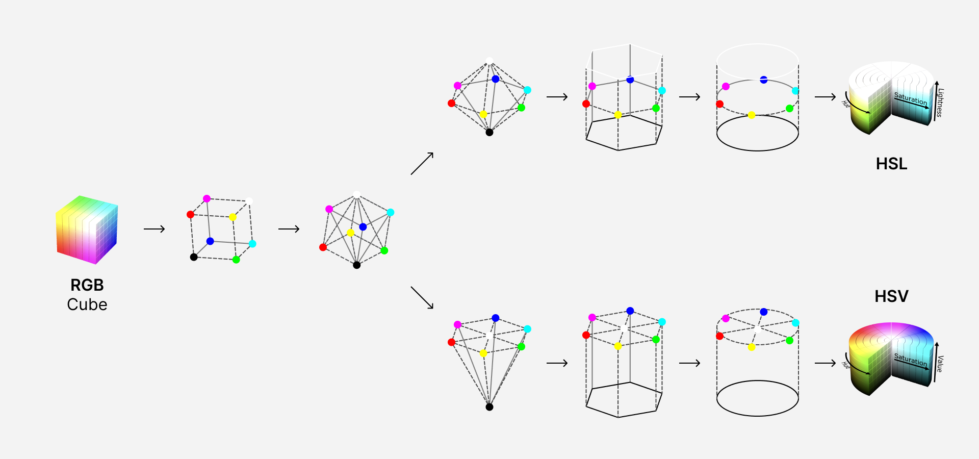
While this scale may have consistent lightness according to the color model, it definitely feels wrong for a human — visually, blue (#00F) is much darker than yellow (#FF0) or cyan (#0FF). This happens because in HSL, fully saturated colors are mapped to the peak RGB values and placed around a Hue circle at a Lightness value of 50, with values of 0 and 100 corresponding to fully black and white, respectively. When a lighter or darker variant of the color is needed, it gets “mixed” with white or black. The central vertical axis comprises the range of neutral or gray colors with a Saturation of zero. (The difference between HSL and HSV is insignificant for this discussion, but instead of “mixing” colors, HSV represents how colors appear under bright light, so the most saturated colors have a Value of 100.)

RGB cube transformation to HSL and HSV cylinders

Based on illustrations by Jacob Rus and Michael Horvath (SharkD), CC BY-SA 3.0, Wikimedia Commons.

Luckily, we’re not limited by computational speed anymore and can use better tools for this job.

Meet CIELAB and LCh

By the time HSL and HSV models were formalized, a better alternative already existed. The International Commission on Illumination (abbreviated CIE) defined the CIELAB or L*a*b* color space back in 1976. It was designed as a perceptually uniform color space, where a given numerical change corresponds to a similar perceived change in color. Unlike the RGB color model, CIELAB is designed to cover the entire range of visible colors, and its Lightness (L*) component closely matches human perception.

Here is how this color space is defined, according to Wikipedia:

The lightness value L* defines black at 0 and white at 100. The a* axis is relative to the green-red opponent colors, with negative values toward green and positive values toward red. The b* axis represents the blue-yellow opponents, with negative numbers toward blue and positive toward yellow.

Earlier, I said that RGB isn’t user-friendly or intuitive. Well, CIELAB really put things into perspective.

Visible gamut within CIELAB color space

Visible gamut within CIELAB color space (see also as a video). a and b are the horizontal axes; L is the vertical axis. Michael Horvath (SharkD), Christoph Lipka, CC BY-SA 4.0, via Wikimedia Commons.

Just as HSL and HSV are easier-to-use cylindrical representations of the RGB, CIELCh or LCh or Lch(ab) color space is a cylindrical representation of CIELAB. Chromaticity components a* and b* are replaced with Chroma (relative saturation) and Hue angle, while Lightness remains unchanged. The Hue angle is similar to the one in HSL, but they’re not identical — HSL/HSV uses the three additive primary colors red, green, and blue (H = 0, 120, 240°). Instead, the LCh system uses the four colors red, yellow, green, and blue (h = 0, 90, 180, 270°). (It’s worth mentioning there is a similar HCL or LCh(uv) color space with a Chroma on a uniform scale from 0 to 100, unlike an LCh(ab) where it varies based on Hue and Lightness.)

Visible gamut within CIELCh color space

Visible gamut within CIELCh color space (see also as a video). L is the vertical axis; C is the cylinder radius; h is the angle around the circumference. Michael Horvath (SharkD), Christoph Lipka, CC BY-SA 4.0, via Wikimedia Commons.

You may notice that, unlike HSL and HSV, LCh fits inside a cylinder but doesn’t fill it. This is expected, as some combinations of Lightness, Chroma, and Hue produce impossible colors — for example, a dark saturated yellow just doesn’t exist. The closer the visible gamut gets to black and white on a Lightness scale, the fewer colors can be distinguished by a human eye. In reality, not even all of these visible colors can be displayed on a screen — the sRGB gamut represents a typical screen and includes only about ⅓ of the LCh color space. That’s what we’re limited to in CSS as well, at least for now.

The sRGB gamut plotted within the cylindrical LCh color space

The sRGB gamut plotted within the cylindrical LCh color space (see also as a video). Michael Horvath (SharkD), Christoph Lipka, CC BY-SA 4.0, via Wikimedia Commons.

Let’s go back to our HSL color scale with Saturation of 100 and Lightness of 50 and see what its Lightness is in LCh:

HSL gradient with LCh Lightness levels

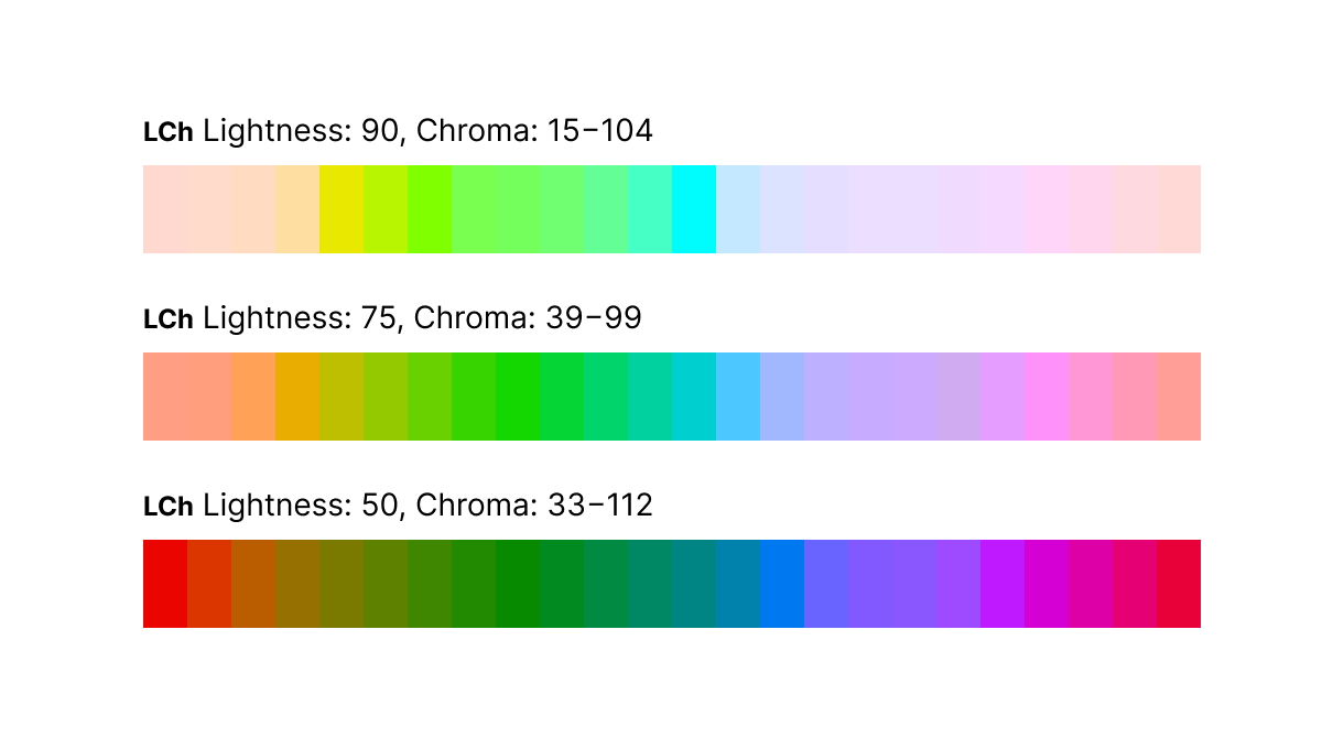
Now, these numbers make more sense — yellow is the lightest color, blue is the darkest, greens are almost three times lighter than blue or twice than reds. Let’s rebuild this scale in LCh with a consistent level of Lightness:

LCh scale with a consistent level of Lightness

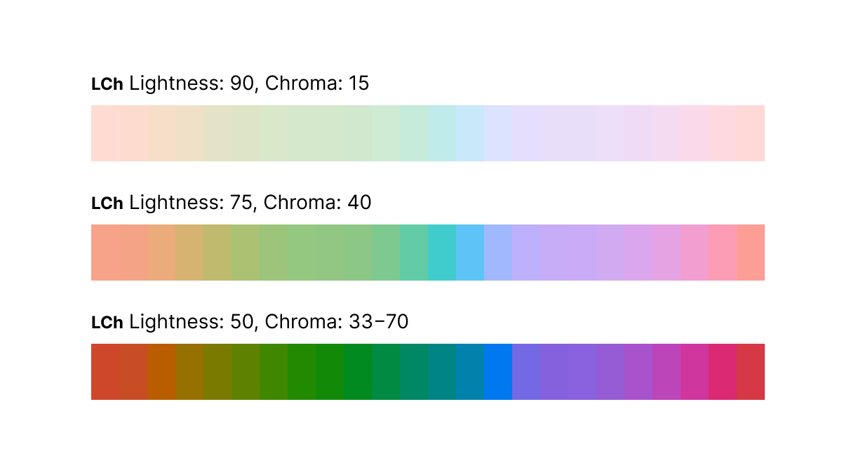
Because of the varied Chroma component, some of these colors are more saturated than others, but their lightness is visually consistent. This doesn’t look good as a gradient but may be desirable in a color system — I want my colors for notifications and warnings more saturated than shades of the base text. Just for curiosity sake, let’s see how these scales look with more consistency in Chroma:

LCh scale with consistent levels of Lightness and Chroma

Smooth as butter, even while we’re dealing with a limited sRGB color space. This is a great foundation for building a color system.

At this point, you may wonder why the design community does not widely use this powerful color space. As of today, neither Figma, Sketch, or Adobe XD support CIELAB or LCh. There is an LCH color picker and Chromatic plugins for Figma, but I didn’t find them sufficient to construct a flexible color system. The ideal tool for the job would generate color variants with persistent lightness, let me control the contrast ratio between them, and be flexible enough to accommodate existing brand colors. That’s when I discovered a Chroma.js library with great LCh support and decided to write a simple tool to generate a new palette from code. After using this tool internally and sharing it with a few friends, we decided to turn it into an app and share it publicly as a project from our Labs.

Introducing Accessible Palette

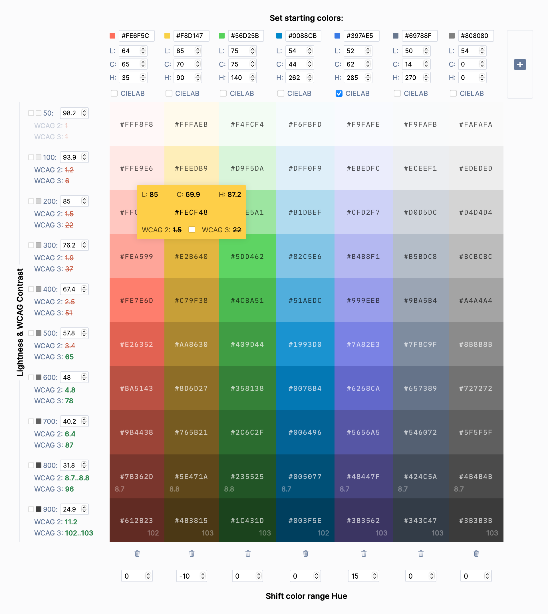
Accessible Palette is an app for building color systems with consistent lightness and predictable contrast ratios across color levels. It’s flexible enough to accommodate existing brand colors and lighter or darker palettes. Let’s see how it works:

The interface of the Accessible Palette app

The interface of the Accessible Palette app

  • You begin by tweaking one of the starting colors or pasting the existing color from your design. The tool will use color’s Chroma and Hue to calculate a scale with multiple lightness levels.
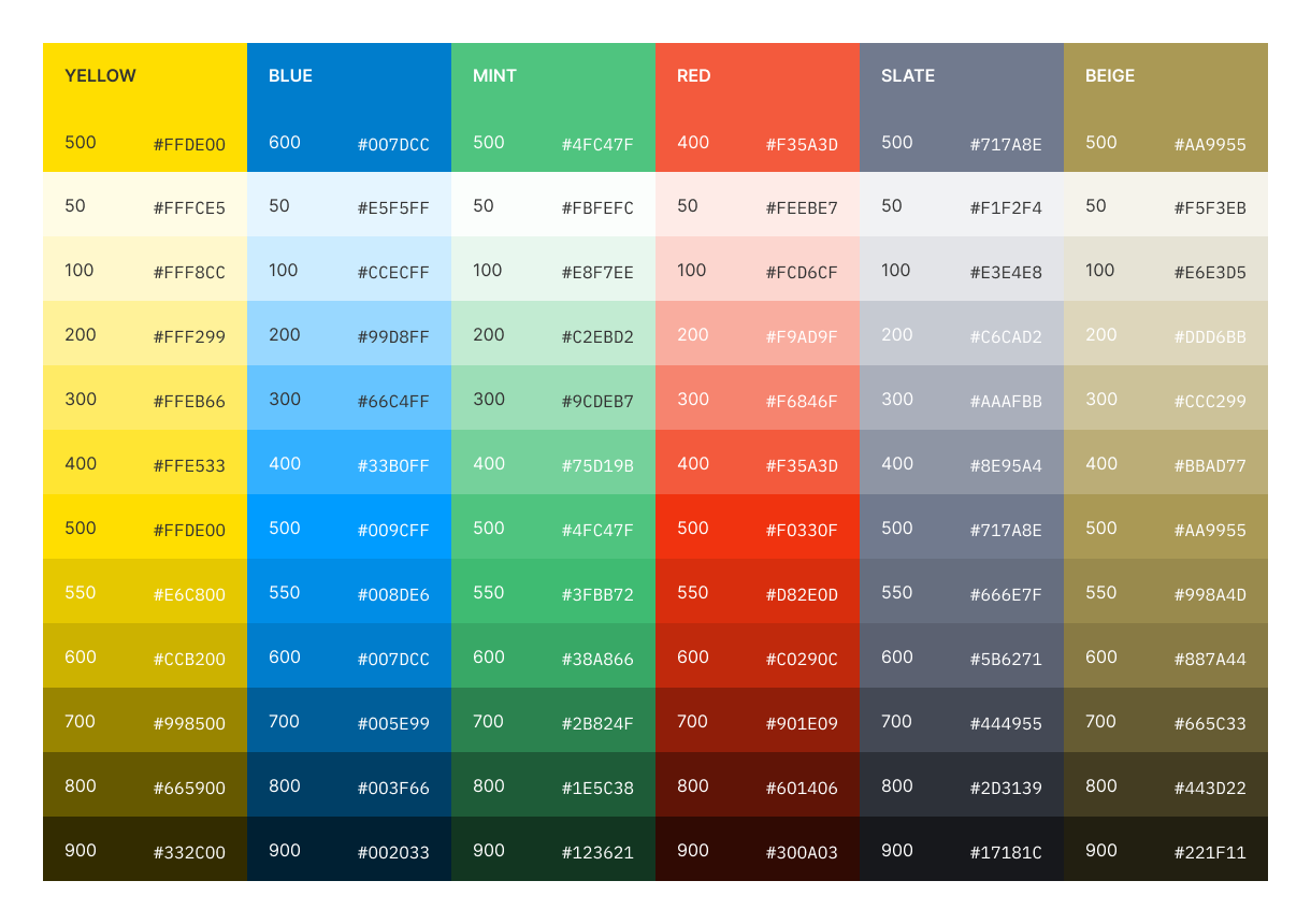
  • Lightness is completely customizable and can work both with light and dark palettes. It also provides granular control over a palette to include existing brand colors. In our case, I wanted to preserve the three most used colors from the original Postmark palette — yellow #FFDE00, blue #007DCC, and green #4FC47F. After taking them as starting colors, I used their Lightness values (88.6, 75.2, and 50.6, respectively) as lightness for levels 200, 400, and 600.
  • Contrast ratio depends on Lightness and is calculated for every level using both current WCAG 2.1 Recommendations and a new algorithm in an upcoming 3.0 Working Draft. (The current way of measuring contrast is flawed, but we’ll talk about this later.) By default, the contrast of every color is measured against a white background, but you can select any color swatch to measure the contrast ratio against it.
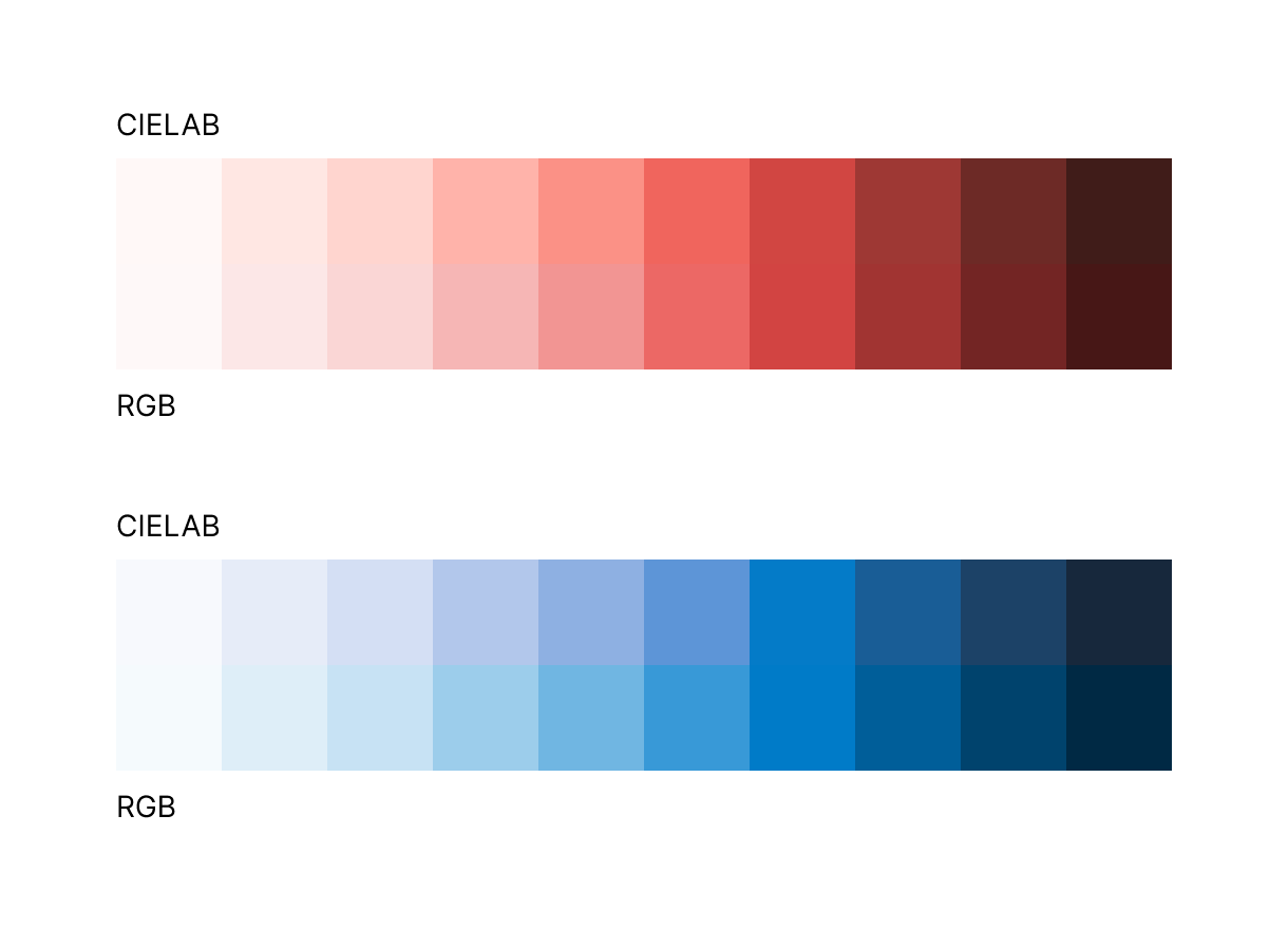
  • Levels can be generated using RGB or CIELAB color space. In some cases, the results can be different, so it’s worth experimenting. In the Postmark color scheme, using CIELAB reduced purplish tint in lighter reds (good) but increased in blues (bad).
Red and blue scales generated in CIELAB and RGB color spaces
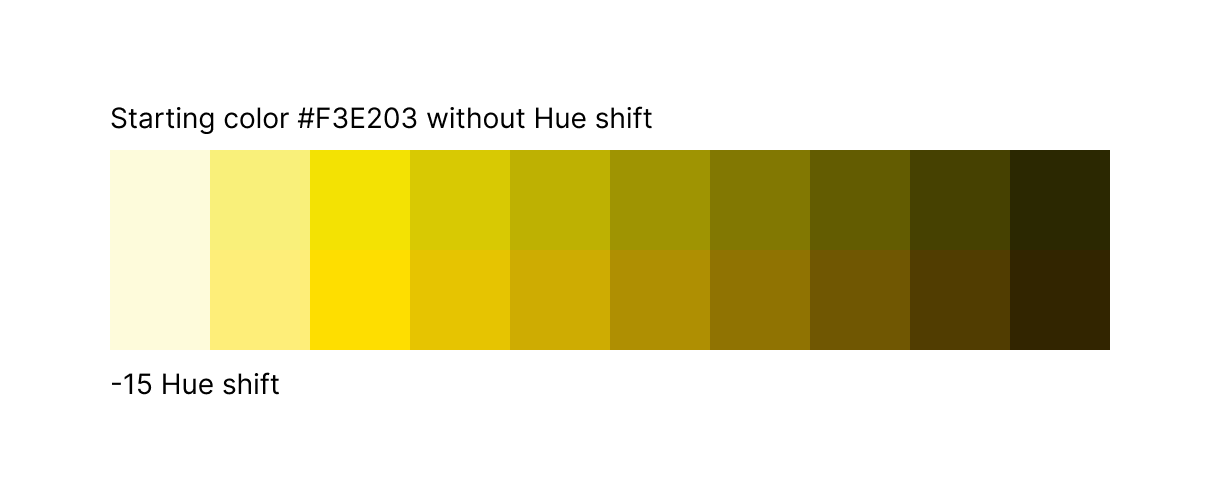
  • For some colors, you may want to shift Hue across the range. Our bright yellow is a good example — as it gets darker, colors get a greenish shade. To shift them a little closer to orange, I use a negative Hue compensation.
Shifting Hue across the range of colors
  • As you use the app, it updates the URL to save changes. Share it with your team, or add it to your Figma library and a CSS file with color variables for future reference.

The app can be used to generate all kinds of color palettes. Use them as a final color system or as a foundation to build upon. To see some real-world examples, check out a new Postmark color palette or palettes based on Google’s Material Design or TailwindCSS. They’re not exact replicas, but alternative takes inspired by the original colors and levels of lightness.

Bonus: How are contrast ratios calculated?

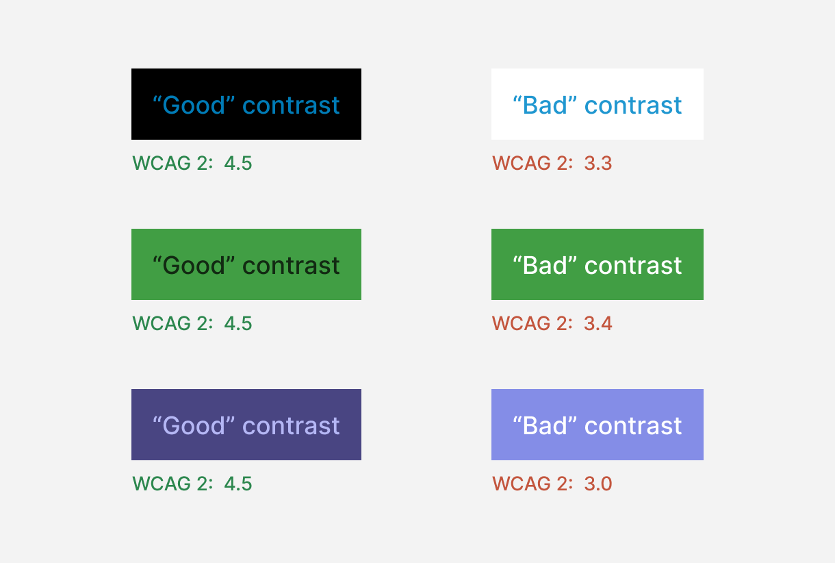
So why does Accessible Palette show two different contrast ratios? WCAG 2.1 calculates the contrast ratio by dividing the luminance of the foreground color by the luminance of the background. The problem is this formula provides a linear response, while humans perceive the contrast between lighter colors as higher than between darker colors. Consider these examples:

Problems with contrast ratio algorithm in WCAG 2.1

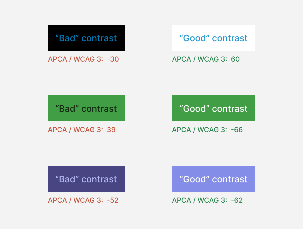
In practice, samples meeting the WCAG 2.1 recommendations are harder to read than those with an “insufficient” contrast ratio. Luckily, W3C is aware of this problem, as Andrew Somers started an open discussion back in 2019. (It’s a fascinating and deep reading if you have a spare evening or two.) He proposed a better working algorithm that is now a part of the WCAG 3 Working Draft and built an APCA Contrast Calculator that is perceptually accurate and also takes font size and weight into account. Accessible Palette uses his Advanced Perceptual Contrast Algorithm (APCA) and considers score 60 as the minimum level recommended for readable text, similar to the old 4.5:1 contrast ratio recommendation in WCAG 2.1.

Let’s see how our examples will hold up with the new algorithm:

Improved contrast ratio algorithm in WCAG 3 Working Draft

Does it mean that WCAG 2.1 contrast ratio is useless? No, it’s still fairly accurate for mid-range colors, but overall the new algorithm is a massive improvement. Keep in mind that it’s still a Working Draft and may change over time. For maximum future-proofness and compliance with current guidelines, try building your color system with both guidelines in mind.

As I started working on Postmark’s new color system, I didn’t expect to give up on the most commonly used color model or question WCAG’s current guidelines. This project led me down the rabbit hole of color theory and resulted in a tool that can help build consistent and accessible color palettes with very little effort. This is a rare situation when both designers and users win in the end. If you end up using Accessible Palette for your project or have questions about it, please send me an email or reach out on Twitter!

]]>
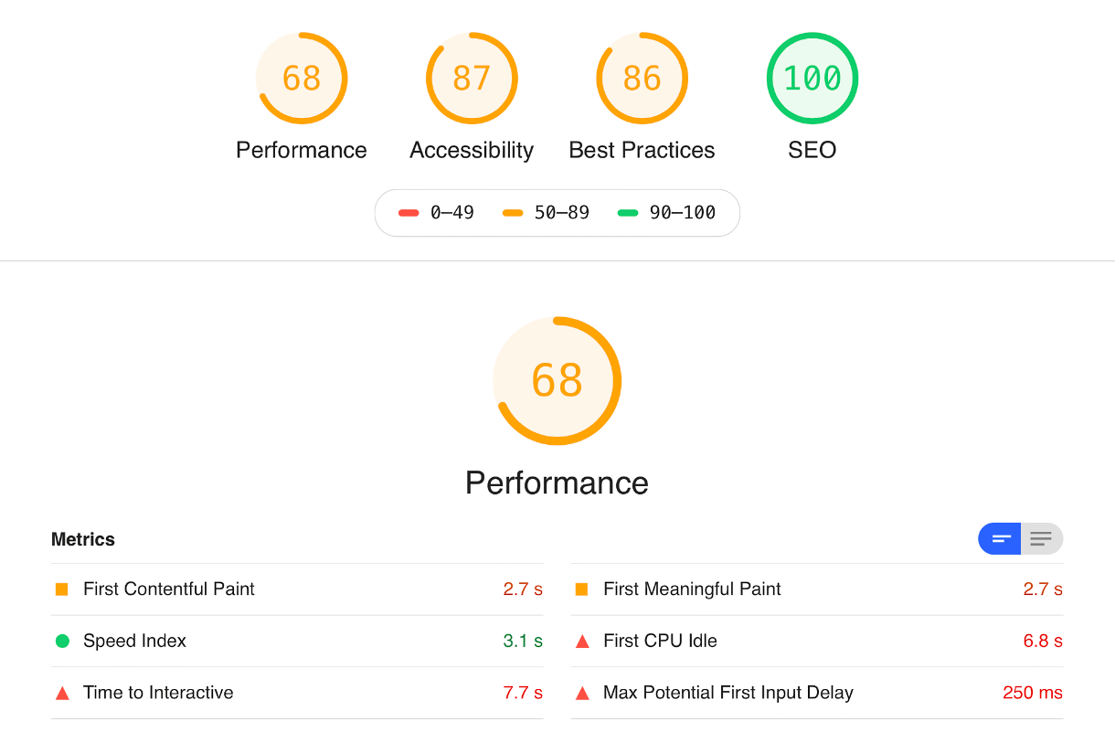
Getting Postmark’s Lighthouse Performance Score to 100 https://wildbit.com/blog/getting-postmark-lighthouse-performance-score-to-100 2020-09-30T14:50:00-04:00 2021-12-07T13:22:26-05:00 Eugene Fedorenko eugene@wildbit.com https://efedorenko.com Earlier this year, our design team spent a few weeks analyzing and improving the performance of the Postmark product website. Our app is known for lightning-fast email delivery, and we wanted to provide a similar experience to the visitors of the website. Conveniently, what’s good for people is also good for robots — search engines increasingly use performance and user experience metrics as a ranking factor in search results. Once completed, this project made the Postmark site significantly faster and increased our Lighthouse Performance score from 68 to a perfect 100.

Web performance problems often creep in unnoticed. We do our best to keep regressions in check, but the nature of releasing something new often works against us. Every change or improvement comes with an increase in size for web assets and a slightly longer loading time. That’s why stepping back to evaluate the bigger picture can provide unexpected insights and discoveries.

The scope of this project was more in line with fixing a few leaky pipes and removing junk than remodeling the whole house or starting new construction. We are still happy with the choice of Craft CMS for our product sites, but it was time to update our DigitalOcean infrastructure and cut some fat from the frontend. Performance improvements often come not from adding the latest and greatest technology, but from showing restraint and removing nice but unnecessary things (very stoic!)

Project #1: The Fake Widget

We started our investigation of the frontend by looking at a timeline of our network requests. The server responded in a reasonable time and pages rendered without major issues, but we observed that resources continued loading in the background for a while. All of these slow-loading assets were from third parties, like web analytics, marketing services, support widgets, etc. After temporarily removing them, the total loading time and Time to Interactive (TTI) decreased by 3x!

How important is TTI? While Time to Interactive is not as critical as perceived loading speed, which is typically measured by First Contentful Paint (FCP) or Largest Contentful Paint (LCP), it keeps the CPU busy and shows the browser’s loading indicator. An argument can even be made that despite its name, in our case, TTI didn’t prevent users from interacting with the page as third party scripts don’t show their UI until fully loaded. Still, we had an easy-to-try idea that could improve both total loading time and TTI.

It wasn’t possible to remove the third party scripts that were responsible for collecting business data, but it was possible to experiment with how the Help Scout chat widget loads on the page. It’s used only occasionally by customers, but always preloads assets for displaying the support window. In total, it makes 16 requests, transferring 576 KB of assets, including a few webfonts and a copy of React. That’s more than our whole home page!

What if we could replace the real widget, which appears as an icon with some text, with a fake replica that loads the real thing after a click?

The fake button, but can you tell?!

This solution is not unique to Help Scout and can be used with any other support or live chat widget. According to the article “How do different chat widgets impact site performance?”, most of them markedly affect performance, and their users (and their users’ customers!) may benefit from this approach.

The solution is an imitation of the original button that looks just like the Help Scout Beacon with our HTML and CSS. When the user clicks it, the fake button hides and loads the original JS from Help Scout — along with everything else. The cookie is set when the widget is opened, so the fake widget is skipped and the real widget is opened immediately if the user navigates to a different page in the middle of a chat.

var FakeBeacon = {
  init: function() {
    document.querySelector('.js-beacon').addEventListener('click', function() {
      FakeBeacon.load(this);
    });
  },

  load: function(el) {
    // Trigger beacon loading
    FakeBeacon.loadScript();

    // Indicate that it's loading
    el.classList.add('is-loading');

    // Once loaded, hide the fake beacon and open the real one
    window.Beacon('once', 'ready', function() {
      el.remove();
      window.Beacon('open');
      Cookies.set('hs-beacon', 'open', { expires: 1 });
    });

    // Once real beacon is closed, revert to the normal behavior
    window.Beacon('on', 'close', function() {
      Cookies.remove('hs-beacon');
    });
  },

  loadScript: function() {
    // Help Scout's original loading code
  }
}

This approach has only two downsides, neither of which was important to us when considering the tradeoffs for increased performance:

  1. Opening the support widget takes a few seconds, since it must load assets after the visitor clicks. We incorporated a spinner to indicate loading progress and provide feedback to the user.
  2. Our Customer Success team can no longer see previously visited pages in Beacon’s History. They are recorded when the widget is fully loaded, which now happens only when the user opens it. This aspect could be important to some support teams but was a worthy tradeoff for us.

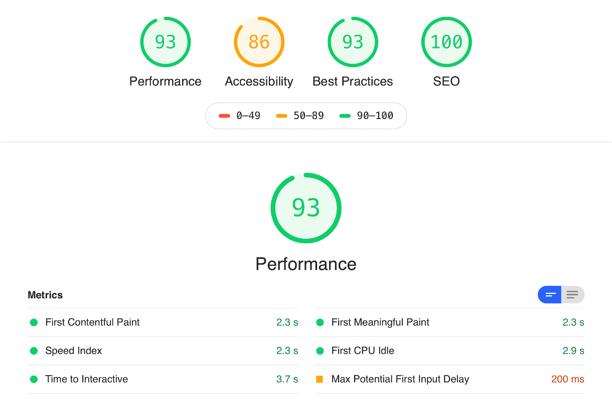
This change only took a couple days to build and increased our Lighthouse Performance score from 68 to 93, Best Practices score from 86 to 93, and reduced Time to Interactive from 7.7s to 3.7s. The Pareto principle states that roughly 80% of the effects come from 20% of the causes, and this is very true in this case.

Project #2: Server Environment

While I was investigating the frontend, Derek Rushforth took care of our backend. Our DigitalOcean droplet was getting old, and we started experiencing issues. Craft CMS couldn’t be updated to the latest version because we were on an older version of PHP. The issues cascaded from there: PHP couldn’t be updated because we were on an older version of our OS. The OS could be updated, but DigitalOcean recommends starting with a new droplet instead.

At Wildbit, the design team is responsible for running our marketing site and landing pages. By configuring servers and managing droplets, we get ultimate control over our setup, but it also takes time and effort. Derek investigated alternatives and tried a managed Craft service from Hyperlane, but the performance was worse than on our old droplet for a much higher price. In the end, he automated infrastructure provisioning with Terraform and built a new environment on DigitalOcean. Our MySQL database was also moved to a separately managed instance, and a Redis instance was built for caching Craft requests. This provided a lot more stability than what we had before.

Ultimately, a new environment reduced our Time to First Byte by 50-150 ms, and now it’s generally in the 200-300 ms range. We didn’t record how it affected the Lighthouse Performance score, but our First Byte Time score in WebPageTest went from B to A.

Project #3: Everything Else

This part involved a bunch of experiments and minor improvements:

  • Removed a Twitter widget from the blog. The widget allowed readers to follow our team members on Twitter without leaving the page, but that functionality didn’t justify the tradeoffs in performance. Removing the widget increased the Performance score of our blog posts by 4 points.
  • Our CSS was 67.7 KB gzipped. Based on Google Analytics, I broke it down into four bundles: core (used on all pages), the home page, blog, and everything else. The resulting CSS was a 3x reduction for the majority of our visitors.
  • Disabled inlining small images into CSS. The bundle was getting too big, and Base64 is not gzip-friendly.
  • Removed a couple of webfonts that were used only in a few places. One font was from TypeKit, so we sent a request even when the font wasn’t used on the page. That left us with a single webfont used on every page, and we now preload it ahead of time.
  • Finally, we removed and refactored some legacy CSS.

These changes increased our Performance score from an already respectable 93 to a great 97. On the most important pages, First Contentful Paint (FCP) improved from ~2.3s to ~1.2s.

The Result

Here is what we started with:

Lighthouse report before any work was done

By introducing the fake chat widget, we dramatically improved the overall result and decreased Time to Interactive and First CPU Idle. Other metrics had a smaller improvement as well.

Lighthouse report after implementing the fake widget

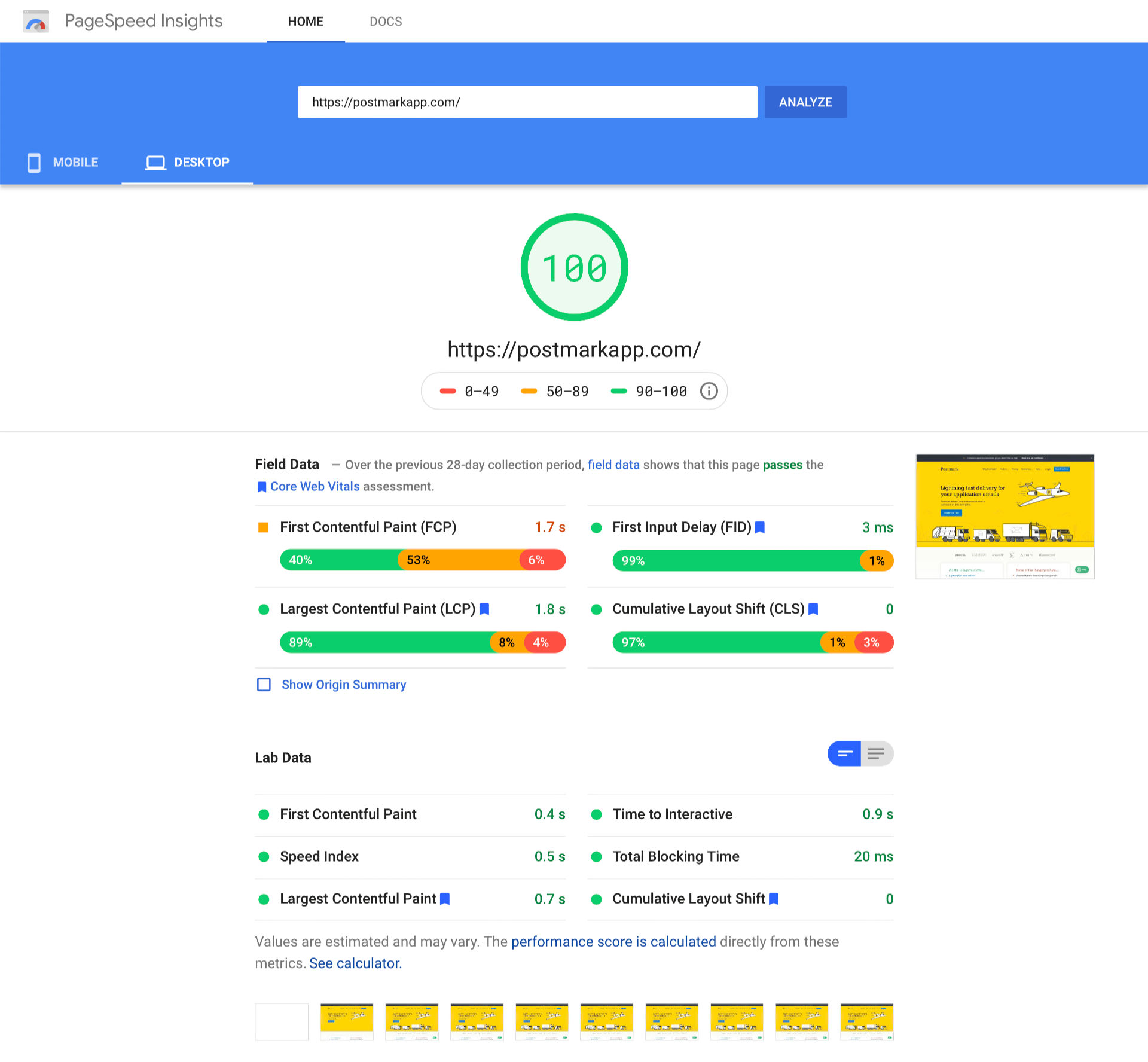
Improvements to the server infrastructure reduced our Time To First Byte (TTFB), which along with miscellaneous frontend updates, helped improve our First Contentful Paint (FCP) from ~2.3s to ~1.2s at the moment of testing. That brought our Performance score to a perfect 100.

Because testing in Chrome’s Developer Tools can be affected by the tester’s internet connection speed and performance of their computer, I confirmed the results in Google’s PageSpeed Insights.

100 score in Google’s PageSpeed Insights

(The vast majority of our website visitors use desktop computers, but we plan to work on improving a Mobile score as well in the future.)

As I mentioned in the beginning, better performance improves the experience for users of our site and improves search engine rankings. Google will also be incorporating Core Web Vitals as one of their ranking signals in the future. Our desktop metrics in Google Search Console already looked good, but the number of pages “needing improvement” on mobile drastically decreased after finishing this project:

Core Web Vitals before vs. after the change

In total, Derek and I spent about 2.5-3 weeks optimizing the frontend and rebuilding servers. Considering we work 4-day weeks at Wildbit, the whole project took about 20 development days.

Our entire team is happy with the outcome, and we hope our customers will feel the difference, even if they couldn’t point to what exactly changed.

]]>
Finding a new home for Conveyor https://wildbit.com/blog/finding-a-new-home-for-conveyor 2020-06-23T11:30:00-04:00 2021-07-09T12:45:31-04:00 Chris Nagele nagele@wildbit.com After more consideration, and a few conversations, we've decided to shut down Conveyor. We'll begin the process on September 1, 2020. Thank you again to all the people who shared their feedback or time with us!

After much internal discussion, we’ve decided to stop working on Conveyor.

Before I get into the details, I want to thank all of the companies who invested their time in Conveyor. You helped us test and put up with our endless questions, surveys, and calls through the process.

I also want to thank the team. Wildbit exists for the team, and Ilya, Eugene, Dima, Chris B, Jeremy, Brian, Derek, and many others poured their heart and soul into this product. At times it was incredibly exciting, and at others, it was completely draining. Natalie and I are so lucky to have a group of passionate, thoughtful friends to work beside, especially on projects like Conveyor.

A decision like this comes with plenty of emotions, questions, and reflection. To pull off the vision for Conveyor, it requires a shift in how developers and software companies think about version control and task management. It requires time, education, and the finesse to experiment with different audiences. After five years of effort and not enough traction, we reached a point where we had to make a decision. It became clear that Wildbit can no longer continue to work on Conveyor, and as a team, we all agreed it was the right decision.

Making tough decisions

December marked a significant investment—roughly 4.5 years and $3 million—since we came up with the idea of Conveyor. Our vision was to blend the Git branch process with task management, removing the redundancy in status updates and bring it closer to where developers work: the Git client.

It was an extremely ambitious project. Looking back, it’s incredible what such a small team pulled off. What started as a web app turned into a native Mac client, which was then torn down and rebuilt into an extremely performant electron app. It’s an entirely new tech stack and environment compared to what we’ve worked on in the past.

As it stands today, we’ve been able to blend project management beautifully with Git, reducing redundancies, and keeping task management closer to the editor. It’s opinionated on purpose. In the second half of 2019, the team was on fire launching things like the Agenda, Team page, Sub-tasks, GitHub integration, and a lot more. The product works extremely well, and we’re proud of it.

But even with solid validation on the problem and a fast, reliable product, adoption was slow. We’ve invited many groups of people, from individual contributors, to project leads, to agencies, but it didn’t resonate the way we had hoped. We still didn’t get the product/market fit we needed.

Lessons learned

Hindsight is always 20/20, and looking back, there are plenty of things we would have done differently. Our initial thought was that we had to own the entire development process, from the Git client to Git hosting to task management to code review, and abstract the unnecessary steps from the development process.

While I don’t think we were wrong, we should have validated those steps individually as best as we could, iterating along the way. Instead, we kept convincing ourselves we needed that “next feature” for it to make sense. One example of this is the Git client. We could have tested the client to work with GitHub as a proof of concept, and with positive feedback, keep building on top of it.

The biggest lesson was waiting too long to make this decision. Five years is an incredibly long time. The progress was motivating, and we had glimpses of validation, but nothing near what we’d seen with previous products. We kept convincing ourselves we were just about to turn a corner, whether it was the Electron rewrite, trying a new audience, or that next crucial feature.

Looking back, I’m amazed that we fell into these traps. We’ve been writing software for twenty years and have enough successful projects to give us confidence. And that fact is the root of the issue. With a talented team, a mature and profitable business, and the confidence to solve any problem, we looked at this product differently. We had time to experiment without a negative financial impact, and the team behind Beanstalk was tackling Conveyor. We convinced ourselves that minimally viable was no longer the proper approach for a team like Wildbit.

It’s fair to say that we stand corrected.

Seeing the positive

In honest reflection, working without validation for such a long period led to feelings of frustration and a decrease in morale. We’re human, and as Dan Pink says, we all have the “…need to direct our own lives, to learn and create new things, and to do better by ourselves and our world.”

We believe businesses should be human. Understanding how our motivations impact our happiness at work, along with the ability to act on that understanding is something we care deeply about at Wildbit.

We’re fortunate that shutting down Conveyor has no direct financial impact on Wildbit. By diversifying across multiple products, we are able to experiment. And after stopping work on Conveyor, we’ve opened up new opportunities for the team.

Chris B and Eugene jumped into People-First Jobs, which we recently launched. It also provided the space to apply these lessons to a new product, DMARC Digests, which Ilya collaborated on with Matt. Dima and Jeremy were able to transition to Postmark, allowing us to make progress on some projects we’ve been hoping to tackle for a while.

What’s next for Conveyor?

We’ve invested significantly in a solid product that works well, but it still requires effort to get the market, messaging, and product in the right place. We’ve considered selling the product, giving it away to a coding school, or open-sourcing it. The correct option hasn’t yet presented itself, but we’re considering all ideas.

Considering that many people still fully believe that developer tools are fragmented, waste time in over-communication, and are too detached, we’d love to see it turn into something.

Our goal is to find Conveyor a new home by the end of September. We hope someone finds value in the overall concept, and it inspires something new. There are still several companies using the product, and we miss Conveyor ourselves! Whether that it is with the Conveyor code base or something from scratch doesn’t matter. We hope someone, or some organization, might find value in the concept and application to take it on, enabling everyone to use a product like this in the future.

]]>
Launching People-First Jobs: why connecting people matters more than ever https://wildbit.com/blog/pfj-launch 2020-04-14T10:28:00-04:00 2021-12-07T15:57:26-05:00 Chris Nagele nagele@wildbit.com The world is different right now, and yet, businesses are somehow expected to operate the same as they have in the past. There’s both spoken and unspoken pressure to return to “business as usual,” especially if you were already a remote team. Simply picking up where you left off leaves many unanswered questions. Chief among them: Is it appropriate to launch a new feature or product right now?

With multiple projects planned for an April release, we’ve grappled with this question. The answer has generally been an easy “no.” With so much stress, uncertainty, and overwhelming information in everyday life, launching just doesn’t feel right, especially if it’s gratuitously feeding off the crisis. For now, those projects will stay quiet, and we’ll open them up when it makes sense.

However, there is one project where we struggled to land on the right answer: People-First Jobs.

A new kind of job board

We announced People-First Jobs back in December, anticipating a launch in early 2020. Our goal with People-First Jobs was to draw attention to companies that exist to support the human beings around them and connect them with job seekers who share those values. We were sick and tired of hearing about “growth at all costs” work environments and wanted to shine a spotlight on companies that are team-centric, profit-focused, and sustainable for the long run. People-First Jobs was near completion in early March when we were faced with a decision: In the midst of a global pandemic, do we launch or not?

With so many layoffs and hiring freezes in the job market as a result of COVID-19, we believe that People-First Jobs can make a meaningful contribution in a moment like this. That’s why we’re launching it today.

People-First Jobs logo

We have some incredible companies onboard, including Wistia, Doist, Zapier, and more. While some have understandably paused hiring at the moment, we’re standing by our goal of raising awareness of the companies that put people first, both now and when they’re ready to hire again. And if you’re looking for a job, we want to help you find one that puts you first.

We have also adapted People-First Jobs to make it valuable for our imperfect existence as the world has changed. In addition to launching the site, the Wildbit team has collaborated with the inaugural round of People-First companies to curate a COVID-19 resource list. We’re sharing and updating that list as we find more useful information, including great people who have been laid off and are currently looking for their next home. If you have additional resources that might be helpful, please help us expand it.

We’re just getting started. We’d like to add more companies, especially those that are currently hiring. If you run or work for a company that meets our People-First criteria, fill out the form, and we’ll be in touch. For the duration of the crisis, we’ll list your jobs at no cost.

Stay safe out there. We’re all looking forward to the days when we can have launch parties. But until then, let’s support each other however we can.

❤️ Team Wildbit

]]>
A job board for companies who put People First https://wildbit.com/blog/people-first-jobs 2019-12-18T13:21:00-05:00 2021-07-09T12:38:21-04:00 Chris Nagele nagele@wildbit.com After a lot of thoughtful conversation and hard work from the team, I’m incredibly excited to announce PeopleFirstJobs.com. It’s a new kind of job board, focused on helping job seekers find companies who put people first.

As we’ve watched funded, growth-at-all-cost companies get all the attention (and admiration) in the job market, Natalie and I want to bring more awareness to companies like ours — team-centric, profit-focused, and sustainable for the long run.

More and more people are searching for a place where they can do incredible work at a reasonable pace, with a team that cares deeply about their success and craft. The problem is, we don’t hire often and don’t always have an opening. Instead of turning them away, we want to create a list of like-minded companies who have job openings.

A new kind of job board

We believe that most job boards have it wrong. Instead of searching for a role, you should seek out a company.

People First Jobs will include a comprehensive list of companies who put people first. These companies realize that businesses exist to support the human beings around them. These are ambitious companies who optimize people over profits while continuing to grow and innovate. While we don’t share all of the same characteristics, we embrace the principles of putting people first.

When we launch in early 2020, companies can get listed as People First for free, and individual job listings will be fee-based. We’re hoping to evolve this, so even if companies do not have openings, you can subscribe and get notified when they do.

In the meantime, subscribe to get notified on launch day.

Help us find more companies!

We have an amazing group of initial supporters who we’ve come to respect over the years — Buffer, Balsamiq, Zapier, Doist, Wistia, Ghost, and Seer. We know there are many more, and we want to include all of them.

Keep in mind, People First companies are not limited to tech or SaaS. If you know of People First companies, please share and have them fill out our form to get involved.

]]>
Removing obstacles: why we integrated Conveyor with GitHub https://wildbit.com/blog/removing-obstacles-why-we-integrated-conveyor-with-github 2019-09-26T06:00:00-04:00 2021-08-23T06:57:43-04:00 Chris Nagele nagele@wildbit.com After much consideration and many conversations, we've decided to shut down Conveyor. We'll begin the process on September 1, 2020. Thank you again to all the people who shared their feedback or time with us!

As we've been opening up Conveyor to more people, we continue to get good feedback. With an early product, focusing on roadblocks is a natural reaction. If you get feedback that someone can't use your product due to a missing feature or compatibility issue, the instinct is to quickly remove those obstacles by adding features or fixing the product. This is also a dangerous game that can send you in a million directions at once. Focusing on the correct obstacles is key, and that all depends on the initial audience you are serving.

With Conveyor, two recent examples are the Windows Client and GitHub Integration. Right now Conveyor is Mac only. For teams who have a mix of Windows and Mac, the product just won't work. On the other side, many teams are already embedded into GitHub, and the switching cost of migrating an entire team's repo hosting to another provider is intense, especially when you are just testing the product. Both of these are highly requested, but choosing which one is more important is difficult.

When looking at both scenarios, we had to decide: Which effort will bring us more adoption? The product is so new that we are still looking for validation, not market expansion. We already know the market of Mac-only teams is large enough, so expanding into teams with mixed environments is too early. We needed to make testing Conveyor easier — to remove the effort it took to try it out as an individual or a team.

Integrating with GitHub makes it easier to try Conveyor, while also pushing off the problems that are already solved - repo hosting. We can let GitHub handle that for now, and if the user prefers, they can switch to our hosting later.

We just released the integration, and it's working extremely well. It's kind of magic how backend Git just makes everything work. A portion of people on a team can use Conveyor, while the rest still use GitHub. This allows testing and adopting the product less effort, helping us validate the Conveyor to a larger audience.

While this seems like such a small decision, the impact is drastic. It could have sent us down a path taking months of engineering effort on a Windows client, spreading us thin and not getting the early results we needed.

Have a look at how the integration works. And if you're currently on GitHub and want to give Conveyor a try, sign up!

[Please use a browser to see embedded content.]

]]>
Conveyor: our switch from native to electron https://wildbit.com/blog/conveyor-our-switch-from-native-to-electron 2018-02-22T16:12:00-05:00 2021-12-07T13:25:02-05:00 Chris Nagele nagele@wildbit.com After much consideration and many conversations, we've decided to shut down Conveyor. We'll begin the process on September 1, 2020. Thank you again to all the people who shared their feedback or time with us!

Conveyor is the most ambitious product we’ve ever attempted. It’s one of those things that is either going to be brilliantly valuable or a brilliant failure. After nearly 2.5 years of active development, we decided to rebuild the entire client from native to Electron. While this meant that the product launch would take even longer, we decided it is worth it to deliver the right experience. A product like Conveyor is not minimally viable. It’s a workflow, and each step in this new workflow has to feel great for it to work as a whole.

Before I get into the details, let me share the story of how we got here. Since Conveyor is our next vision for Beanstalk we decided it could not just be a hosted web application. For us to make something great, the product had to live on developers machines as a client and provide the centralized hosting and collaboration. We needed to support the entire workflow and be as close to developers code as possible.

A product like Conveyor is not minimally viable. It’s a workflow, and each step in this new workflow has to feel great for it to work as a whole.

To do this, we had to make a decision between building a native macOS client or using something like Electron. A couple of years ago when we looked at Electron, it didn’t feel integrated enough in the operating system. The design and experience did not feel polished, and it felt like it would not provide the experience we wanted to deliver. We decided the initial client would be a native Mac app. While it’s limited in audience, it would allow us to create a polished experience from the start. As a company who works only on web applications, this was a big risk, and we felt it was worth it. So we went all in on native.

The process was an uphill battle to say the least. After two years and some really good hindsight, we realized it was not the best decision for our team. Not only did we have to learn an entirely new development process, but the process itself was changing in front of us with the introduction of Swift. As a team used to iterating quickly on design, the concept of handing off design felt unnatural and took much longer for us. Instead of us finding the proper process, we ended up fighting it.

Admitting defeat

Toward the end of last year we had a working client with a (very) small set of beta testers. It worked, and we even used it on real projects. As we got closer to our private beta launch date we had a chance to reflect honestly on the client, and we just weren’t proud of it. The web app is fantastic, but the client just wasn’t up to our standards. It was hard to update, and in reality, it hardly looked “native” anyway with the design direction we chose. We never really reached the performance and user experience goals that we picked native for in the first place.

Conveyor's workspace overview

We realized that if this was our future product we’d never be happy and it would never succeed. So we did what any respectable team would do: we threw it out. This was incredibly hard to admit, but I have no doubt it was the right decision.

Another look at Electron

We were only able to make this decision because we had time to look at the alternatives. It had been a couple of years since we researched Electron, and at this point (Dec 2017), it had matured a lot. We decided to do a small proof of concept. Surprisingly it was a breath of fresh air. Not only because the tool set had improved, but because we missed the agility of working on a web application. The development experience was familiar again, and it felt fantastic. After fighting the native client for so long, and dealing with some emotional ups and downs, our motivation and enthusiasm was in full force.

Now here we are, a few months later, and even though we are completely rewriting the client it’s moving extremely fast. From the design, to the syncing process, to the tools we are using it’s turning into a product we are extremely excited and proud to build. The solution we are putting together is based on all of the mistakes we made the first time around. And it helps to have 2.5 years of iterating on design along with a very good backend to support it.

It’s worth the wait

This was a really hard choice and it set us back about six months. It was the correct decision though. With a profitable company that affords us to be patient and a mission to only work on things that we get excited about, we had to do it. When it’s done we will have a much better experience, and even better, it will work on multiple platforms!

Get on the list for early invites or follow Conveyor on Twitter as we share more news.

]]>
Working on the next little thing https://wildbit.com/blog/working-on-the-next-little-thing 2018-01-25T15:07:00-05:00 2018-08-09T09:41:54-04:00 Chris Nagele nagele@wildbit.com When you first start a product, you have a small set of problems you want to solve for a specific audience, and you go all in. As a product gains customers and grows, you have to focus on what’s next. How are customers using the product? Where can we make the product even more valuable? Where can we remove more pain? Or, wouldn’t it be great if…

I think this is where product owners get into trouble. We always tend to think about the next big thing. How are we going to blow our customers away and separate ourselves from our competition? It has to be something amazing. Something press worthy.

But you also need to constantly refine your product in the places that you have not looked at for years. Because while you may have not looked at it in years, your customers are looking at it every day, and possibly experiencing pain in the process. Eventually you look back at your product and realize that while you launched some great new features, it’s starting to feel rough. It’s being neglected.

We work hard to make sure this never happens in Postmark. While we collect support requests, talk to customers, and review old features, it can be difficult to identify where customers feel pain in the product. So on Tuesday we asked a very focused question:

What annoys you about Postmark?

The response has been incredible. This was a one-question survey. It didn't ask about on boarding, or target a certain group of users. Instead, we asked a single leading question knowing that we must have those little annoying parts that wear people out every time they use our product.

The responses that came back brought a huge smile to our faces. It wasn’t the quantity of responses, it was the granularity of the response. While some of the things are known, we uncovered a list of small but valuable changes we can make to improve the daily experience for customers. And while they seem like little annoyances, they are actually giant inconveniences. Things like organizing the servers page, or searching sender domains. Solving each one can have just as much impact as the next big thing, and we plan to do just that.

We have to realize customers purchased our products for the features and experience that existed when they signed up. Yes, we have to focus on opening up the audience, but we can’t forget to constantly improve the original ideas and experiences. Most of us created our product out of frustration from another bad experience. We have to work hard to make sure our own products are never the source of that frustration.

]]>
DeployBot has a new home https://wildbit.com/blog/deploybot-has-a-new-home 2017-12-19T14:16:00-05:00 2018-08-09T09:41:53-04:00 Natalie Nagele natalie@wildbit.com I’m excited to announce that we’ve found a new home for our beloved DeployBot!

Why sell a growing product?

The most common question Chris and I get when people hear that we run multiple products is how on Earth can we focus on so many things at once. The answer is always: it’s tricky. Since Wildbit exists for its’ team, the diversification of products makes us sleep better at night. Knowing that we don’t have all of our eggs in a single basket allows us to make sure that we can be around for a really long time.

One of the reasons it has worked so well for us is because often our products are in different stages of their life. Meaning, our attention can be focused on one product at a time. When we launched Postmark, Beanstalk was already an established product. By the time DeployBot came along, the other two were humming along.

Things changed for us 2 years ago. As a team we saw huge potential in Postmark and we really wanted to commit to growing it. In reflection, Chris and I have never actually “grown” a product. We realized we’re very good at building and shipping, but this was going to be a very new challenge for us. Almost simultaneously we realized we needed to do something with Beanstalk to bring it new life. We decided we were going to build a whole new product and dedicated a team towards the long road to get there. And there was this new product, DeployBot. Ripe with opportunity, but complicated to grow given the various stages of the development process still being evolved in the real world.

Chris and I quickly saw that we were headed deep under water with all of those strategic projects to juggle. Something had to give. So we took a hard look at our product suite. Postmark’s momentum was so strong. With the huge potential for success, Postmark was a product we had to see through. The new product Conveyor was important too. Beanstalk’s customers deserve a better solution after 10 years. And DeployBot was the only product we weren’t sure of. While it was growing and users loved it, the deployments space is really complicated. There are so many potential markets and ways software teams ship software. To really help DeployBot grow we’d have to spend a lot of our bandwidth on it as well. So with all that information we moved most of our team onto Conveyor and Postmark, while continuing to maintain and support DeployBot.

All this time we knew we had to decide what to do with DeployBot. Maintenance mode is not something you stay in for long, or something we are proud of, but we had no idea you could really just sell an app. After seeing many friends do it, we realized that we could find someone else to take what we built and make it shine. So this year, through a referral from Garrett Dimon on our team, we worked with FE International to see if we could find a buyer. It wasn’t easy (more later) but we’re so relieved and excited that we’ve found someone we think will be great.

DeployBot’s new caretakers

The team that acquired DeployBot is originally from Germany. Tim, the owner, partnered with bevuta IT, a software company with a vast variety of experiences. Chris and I really wanted to find a team that was willing to invest in the product. They needed to have the experience and enthusiasm to grow DeployBot and take care of everyone who has come to depend on it in their workflow.

I was really excited after our first call. Tim really seamed to get it. He has put together an awesome team dedicated just to DeployBot. They are currently working closely with our team to get up to speed. In the meantime, Wildbit is still doing the first line of support so that customers get as seamless a transition as possible.

In the last few weeks as we’ve worked together on the migration, I have felt tremendous relief. While I felt good with our decision on the buyer, there was always anxiety about what reality would be like. So far, I’m feeling excellent with our choice. Tim and his team are smart and caring and super enthusiastic to take DeployBot out of maintenance mode and turn it into the premier deployment product it should be.

What’s next?

We are still working very closely with the new owners to help them get up to speed. Chris Bowler and Brian Kerr are continuing to be the first line of support for existing customers, while their support team learns the ins and outs of helping DeployBot customers. Come February, Wildbit will be completely removed from the day to day of the product.

What I want to make very clear, and what I said to Tim several times, is that Chris and I want and intend to walk away from this deal making a new friend. We want to support them on the product and direct customers as much as possible. We are so excited for what they can bring to the product and are cheering them on.

There are a lot of mixed emotions right now. I think we’re all a little sad that we’re no longer the guardians of our little robot. We’re so incredibly grateful for the customers that signed up and trusted us with deploying their projects. And we’re relieved to be able to to focus on Conveyor and Postmark.

Please join me in our continued support and encouragement of the new stewards of DeployBot. Let’s cheer them on together.

So much ❤️,
Natalie

]]>