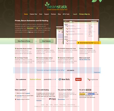
You might have noticed by now, but we gave Beanstalk’s landing site a new, fresh look. While we were always very happy with the identity itself (logotype, colors, etc.), the landing site got cluttered over time because we added several elements (like customer logos) which weren’t really planned right from the beginning.
Git support was probably the biggest update for quite some time, so it did make perfect sense to relaunch the landing site at the same time. I didn’t try to reinvent the wheel here and decided to use the fairly basic 960 grid system, which you can see below. We didn’t use their CSS though, we always prefer to write our own code instead of relying on any 3rd party code or frameworks. The site is our first official HTML5 project and Eugene had a lot of fun with it, he’ll go more into detail in another post.

Besides the visual and technical updates, we also set some goals on the content which we wanted to achieve. A lot of customers asked us about the security of Beanstalk, so instead of answering the same questions over and over again, we build it into the site. Since security is a concern for customers, we made a bit more prominent on the homepage too:

Another thing I want to mention is the Feature Tour. You probably remember our old homepage, where we built the slides right into the header area. While this was an elegant solution, it was also very limited at the same time: the slides weren’t easily extendable. That’s why a separate page is a much more future-proof solution.
I hope you enjoy our new site, feel free to ask any questions.

