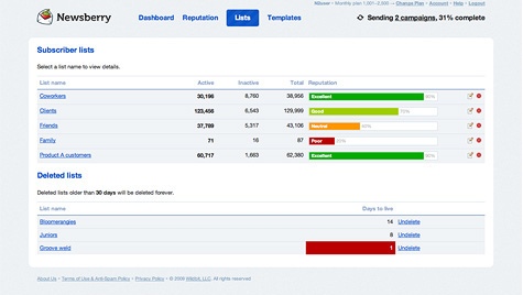
It was about time that we finally redesigned the public site of our Email Marketing application, Newsberry. I'm very proud that I had the chance to do this — I kind of lurked on this task since I started working at Wildbit.
Besides the fact that we are very happy that this happened, I want to talk about the use of icons on the site today. Long story short, for myself icons have two big roles when it comes to design:
- Explain certain actions visually, so they are more clear to the user
- Support the visual design

In general, icons can contribute to your overall design the same way a typeface, a color or an image — they don't have a minor role in the visual hierarchy. I stumbled upon a lot of websites which make use of free or stock icons. I don't want to convict the use of them, but in my eyes custom made icons really help to make your design stand out from the crowd.
That said, it was a no-go for me to use free or stock icons anywhere on Newsberry. Even if they don't match the taste of the shiny-icon crowd, I put a lot of love in these little bunch of pixels. Come on guys, it's easier than you think — inspiration and help is everywhere.
So, I hope you enjoy the new look of the site. What? You ask if the new public site is the last stop on the road? No Sir, there are more adventures ahead of us:


