A month ago, Wildbit released a mobile-optimized view of Beanstalk which is very handy for code-collaboration on the go. While researching for this project, I was surprised to find that mobile usage is slowly passing usage of IE 6-8 at Beanstalk. It’s like a dream come true!
Mobile isn’t just in the browser
David Greiner from Campaign Monitor recently posted results from their report and it’s fascinating to see that mobile email clients grown from 4% to almost 20% of the market in just 2 years! From their historical chart, it seems fairly certain that mobile email usage will overgrow desktop email usage in a year or two. Thinking about my own iPhone usage supports these statistics — I check emails, feeds and tweets all the time, but go into Mobile Safari only when I have a good reason.
With this in mind, I began to think about Beanstalk’s emails — newsletters, digests and commit notifications. We’ve made them quite nice in desktop and web clients, but what about mobile clients? Can we keep them nice and readable here? Turns out we can! Mobile Mail on iPhone supports media queries, which makes possible to use the same responsive web design technique we applied to the rest of Beanstalk. How cool is that?
I’d like to show you how we applied screen-size specific media queries to target styles, and what design decisions were made to make the mobile email experience much better
Digests
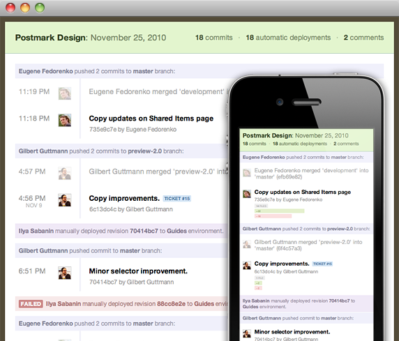
I started with our Daily Digest emails, which provide an overview of the previous 24 hours activity for a given Beanstalk repository.
First was to add a media query for the iPhone’s small screen:
@media only screen and (max-device-width: 480px) { ... }After improving font sizes and margins it was clear that mobile version was too cramped, so I decided to hide the commit time. It’s usually more important to see what’s changing than when exactly something was committed, and the time is still presented on changeset page for reference if needed. Next, I reformatted the changes summary — a vertical layout worked much better on a small screen. And the last change was to reformat header into two lines instead of just one. Here is how digests look now:

I noticed minor visual issues on iPad, but they were easy to fix by targeting with this media query for the iPad’s screen size:
@media only screen and (min-device-width: 768px) and (max-device-width: 1024px) { ... }Newsletter
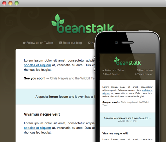
We also send a regular newsletter to Beanstalk customers, and with experience from digests, it was a piece of cake!

I improved font sizes and margins to use more of the screen space, resized the logo to be proportional to the screen, reorganized the navigation to avoid wrapping, and made images flexible. Now our newsletter doesn’t need any pinch-zooming to navigate and is much more readable on small screens!
What I have learned
- Testing in a mobile email client and not just in mobile browser or resized desktop browser is more important now than ever before. Mobile Safari and Mail on iPhone don’t work exactly the same.
- It’s not easy to customize layout based on table cells, but display: block; and negative margins work really well for for small changes.
- In my tests it seems like <meta name="viewport"> (?) doesn’t work in Apple Mail. This caught me off-guard, and may cause you problems as well.
- At first I tried to keep width of emails flexible but in a result every digest had different scaling based on content. That looks really weird if you receive a few digests every day. Sometimes it’s better to keep things fixed at 320px. This requires thinking about your use case!
- Yahoo! Mail removes media queries and applies all included mobile stylesheets to web client, but there is an easy fix for that.
Conclusion
It’s not hard to optimize emails for mobile email clients, and the result is worth it! Even while we still use table layouts and inline stylesheets for emails in 2011 it feels like a fresh breeze to drop in some media queries and advanced stylesheets for the clients that can support them.
We’ll continue to optimize our HTML emails here at Wildbit, and would like to see more optimized emails from the apps we use and love every day as well. Hopefully sharing our experience helps make that a reality!

