The new Newsberry has been online for quite some time, and you might have noticed that some things are different. We mostly applied the new look of the public site to the application, but one thing needed a serious overhaul...
The Navigation
We have to admit that the navigation was not entirely easy to understand on the previous version. The biggest problem was that the hierarchy of the different navigation elements was torn appart. The new version does a much better job at grouping all the actions and presenting them with much better visual weight.
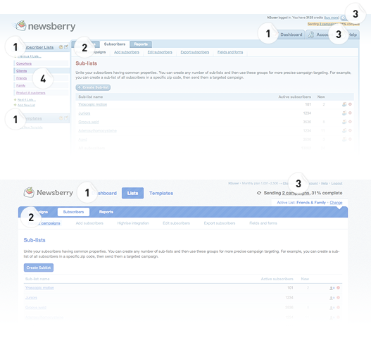
Have a look at the Subscribers page for example. I’ve marked the different navigation levels with numbers, with 1 being the the highest level and 4 being the lowest. As you can see, the new design even got rid of the fourth level, making it much easier for navigating through the application. At the same time, your eye does not need to jump from left to right/right to left when you move between the main areas (Dashboard, Lists and Templates).

Yes, we removed the left sidebar
Some customers might be a bit confused that we removed the left sidebar. But we did this in favor of consistency. For instance, a Camapaign was created within the Campaigns section of the application. Lists and Templates were created via the sidebar. Sounds wrong, doesn’t it?
Now, we basically had two options:
- Add a “Create Campaign” button to the sidebar.
- Remove the sidebar and add “Create List” and “Create Template” buttons, just like the “Create Campaign” button.
As you probably noticed, option two won. Removing the sidebar really helped to clean up the overall design, which results in less confusion for the viewer.
We really hope that these changes help to speed up your interaction with Newsberry and make the overall experience more fun.

